Innehållssamlare
Designing A Streak System: The UX And Psychology Of Streaks
I’m sure you’ve heard of streaks or used an app with one. But ever wondered why streaks are so popular and powerful? Well, there is the obvious one that apps want as much of your attention as possible, but aside from that, did you know that when the popular learning app Duolingo introduced iOS widgets to display streaks, user commitment surged by 60%. Sixty percent is a massive shift in behaviour and demonstrates how “streak” patterns can be used to increase engagement and drive usage.
At its most basic, a streak is the number of consecutive days that a user completes a specific activity. Some people also define it as a “gamified” habit or a metric designed to encourage consistent usage.
But streaks transcend beyond being a metric or a record in an app; it is more psychological than that. Human instincts are easy to influence with the right factors. Look at these three factors: progress, pride, and fear of missing out (commonly called FOMO). What do all these have in common? Effort. The more effort you put into something, the more it shapes your identity, and that is how streaks crosses into the world of behavioural psychology.
Now, with great power comes great responsibility, and because of that, there’s a dark side to streaks.
In this article, we’ll be going into the psychology, UX, and design principles behind building an effective streak system. We’ll look at (1) why our brains almost instinctively respond to streak activity, (2) how to design streaks in ways that genuinely help users, and (3) the technical work involved in building a streak pattern.
The Psychology Behind StreaksTo design and build an effective streak system, we need to understand how it aligns with how our brains are wired. Like, what makes it so effective to the extent that we feel so much intense dedication to protect our streaks?
There are three interesting, well-documented psychology principles that support what makes streaks so powerful and addictive.
Loss AversionThis is probably the strongest force behind streaks. I say this because most times, you almost can’t avoid this in life.
Think of it this way: If a friend gives you $100, you’d be happy. But if you lost $100 from your wallet, that would hurt way more. The emotional weight of those situations isn’t equal. Loss hurts way more than gain feels good.
Let’s take it further and say that I give you $100 and ask you to play a gamble. There’s a 50% chance you win another $100 and a 50% chance you lose the original $100. Would you take it? I wouldn’t. Most people wouldn’t. That’s loss aversion.
If you think about it, it is logical, it is understandable, it is human.
The concept behind loss aversion is that we feel the pain of losing something twice as much as the pleasure of gaining something of equal value. In psychological terms, loss lingers more than gains do.
You probably see how this relates to streaks. To build a noticeable streak, it requires effort; as a streak grows, the motivation behind it begins to fade; or more accurately, it starts to become secondary.
Here’s an example: Say your friend has a three-day streak closing their “Move Rings” on their Apple Watch. They have almost nothing to lose beyond wanting to achieve their goal and be consistent. At the same time, you have an impressive 219-day streak going. Chances are that you are trapped by the fear of losing it. You most likely aren’t thinking about the achievement at this point; it’s more about protecting your invested effort, and that is loss aversion.
Duolingo explains how loss aversion contributes to a user’s reluctance to break a long streak, even on their laziest days. In a way, a streak can turn into a habit when loss aversion settles in.
The Fogg Behaviour Model (B = MAP)Now that we understand the fear of losing the effort invested in longer streaks, another question is: What makes us do the thing in the first place, day after day, even before the streak gets big?
That’s what the Fogg Behaviour Model is about. It is relatively simple. A behaviour (B) only occurs when three factors — Motivation (M), Ability (A), and Prompt (P) — align at the same moment. Thus, the equation B=MAP.
If any of these factors, even one, is missing at that moment, the behaviour won’t happen.
So, for a streak system to be efficient and recurring, all three factors must be present:
Motivation
This is fragile and not something that is consistently present. There are days when you’re pumped to learn Spanish, and days you don’t even feel an iota of willpower to learn the language. Motivation by itself to build a habit is unreliable and a losing battle from day one.
Ability
To compensate for the limitations of motivation, ability is critical. In this context, ability means the ease of action, i.e, the effort is so easy that it’s unrealistic to say it isn’t possible. Most apps intentionally use this. Apple Fitness just needs you to stand for one minute in an hour to earn a tick towards your Stand goal. Duolingo only needs one completed lesson. These tasks do not require all that much effort. The barrier is so low that even on your worst days, you can do it. But the combined effort of an ongoing streak is where the idea of losing that streak kicks in.
Prompt
This is what completes the equation. Humans are naturally forgetful, so yes, ability can get us 90% there. But a prompt reminds us to act. Streaks are persistent by design, so users need to be constantly reminded to act. To see how powerful a prompt can be, Duolingo did an A/B test to see if a little red badge on the app’s icon increased consistent usage. It produced a 6% increase in daily active users. Just a red badge.
All this being said, there is a limitation to the Fogg model whereby critics and modern research have noticed that a design that relies too heavily on prompts, like aggressive notifications, risks creating mental fatigue. Constant notifications and overtime could cause users to churn. So, watch out for that.
The Zeigarnik EffectHow do you feel when you leave a task of project half-done? That irritates many people because unfinished tasks occupy more mental space than the things we complete. When something is done and gone, we tend to forget it. When something is left undone, it tends to weigh on our minds.
This is exactly why digital products use artificial progress indicators, like Upwork's profile completion bar, to let a user know that their profile is only “60% complete”. It nudges the user to finish what they started.
Let’s look at another example. You have five tasks in a to-do list app, and at the end of the day, you only check four of them as completed. Many of us will feel unaccomplished because of that one unfinished task. That, right there, is the Zeigarnik effect.
The Zeigarnik effecthe was demonstrated by psychologist Bluma Zeigarnik, who described that we tend to keep incomplete tasks active in our memory longer than completed tasks.
A streak pattern naturally taps into this in UX design. Let’s say you are on day 63 of a learning streak. At that point, you’re in an ongoing pattern of unfinished business. Your brain would rarely forget about it as it sits in the back of your mind. At this point, your brain becomes the one sending you notifications.
When you put these psychological forces together, you begin to truly understand why streaks aren’t just a regular app feature; they are capable of reshaping human behaviour.
But somewhere along the line — I can’t say exactly when, as it differs for everyone — things reach a point where a streak shifts from “fun” to something you feel you can’t afford to lose. You don’t want 58 days of effort to go to waste, do you? That is what makes a streak system effective. If done right, streaks help users build astounding habits that accomplish a goal. It could be reading daily or hitting the gym consistently.
These repeated actions (sometimes small) compound over time and become evident in our daily lives. But there are two sides to every coin.
The Thin Line Between Habit And CompulsionIf you have been following along, you can already tell there’s a dark side to streak systems. Habit formation is about consistency with a repeated goal. Compulsion, however, is the consistency of working on a goal that is no longer needed but held onto out of fear or pressure. It is a razor-thin line.
You brush your teeth every morning without thinking; it is automatic and instinctive, with a clear goal of having good breath. That’s a streak that forms a good habit. An ethical streak system gives users space to breathe. If, for some reason, you don’t brush in the morning, you can brush at noon. Imperfection is allowed without fear of losing a long effort.
Compulsion takes the opposite route, whereby a streak makes you anxious, you feel guilty or even exhausted, and sometimes, it feels like you haven’t accomplished anything, despite all your work. You act not because you want to, but because you’re subconsciously terrified of seeing your progress reset to zero.
Someone even described this perfectly, “I felt that I was cheating, but simply did not care. I am nothing without my streak”. This shows the extreme hold streaks can have on an individual. To the extent that users begin to tie their self-worth to an arbitrary metric rather than the original goal or reason they started the streak in the first place. The streak becomes who they are, not just what they do.
A well-designed ethical streak system should feel like encouragement to the user, not pressure or obligation. This relates to the balance of intrinsic and extrinsic motivation. Extrinsic motivation (external rewards, avoiding punishment) might get users started, but intrinsic motivation (doing the task for a personal goal like learning Spanish because you genuinely want to communicate with a loved one) is stronger for long-term engagement.
A good system should gravitate towards intrinsic motivation with careful use of extrinsic elements, i.e., remind users of how far they have come, not threaten them with what they might lose. Again, it is a fine line.
A simple test when designing a streak system is to actually take some time and think whether your products make money by selling solutions to anxiety that your product created. If yes, there’s a high chance you are exploiting users.
So the next question becomes, If I choose to use streak, how do I design it in a way that genuinely helps users achieve their goals?
The UX of Good Streak System DesignI believe this is where most projects either nail an effective streak system or completely mess it up. Let’s go through some UX principles of a good streak design.
Keep It EffortlessYou’ve probably heard this before, maybe from books like Atomic Habits, but it’s worth mentioning that one of the easiest ways habits can be formed is by making the action tiny and easy. This is similar to the ability factor we discussed from the Fogg Behaviour Model.
The first rule of any streak design should be making the required action as small as humanly possible while still achieving progress.
If a daily action requires willpower to complete, that action won’t make it past five days. Why? You can’t be motivated five days in a row.
Case in point: If you run a meditation app, you don’t need to make users go through a 20-minute session just to maintain the streak. Try a single minute, maybe even something as small as thirty seconds, instead.
As the saying goes, little drops of water make the mighty ocean). Small efforts compile into big achievements with time. That should be the goal: remove friction, especially when the moment might be difficult. When users are stressed or overwhelmed, let them know that simply showing up, even for a few seconds, counts as effort.
Provide Clear Visual FeedbackHumans are visual by nature. Most times, we need to see something to believe; there’s this need to visualize things to understand them better and put things into perspective.
This is why streak patterns often use visual elements, like graphs, checkmarks, progress rings, and grids, to visualize effort. Look at GitHub’s contribution graph. It is a simple visualization of consistency. Yet developers breathe it in like oxygen.
The key is not to make a streak system feel abstract. It should feel real and earned. For instance, Duolingo and Apple’s Fitness activity rings use clean animation designs on completion of a streak, and GitHub shows historical data of a user’s consistency over time.
Use Good TimingI mentioned earlierthat humans are generally forgetful by nature, and that prompts can help maintain forward momentum. Without prompts, most new users forget to keep going. Life can get busy, motivation disappears, and things happen. Even long-time users benefit from prompts, though most times, they are already locked inside the habit loop. Nevertheless, even the most committed person can accidentally miss a day.
Your streak system most definitely needs reminders. The most-used prompt reminders are push notifications. Timing really matters when working with push notifications. The type of app matters, too. Sending a notification at 9 a.m. saying “You haven’t practiced today” is just weird for a learning app because many have things to do in the day before they even think about completing a lesson. If we’re talking about a fitness app, though, it is reasonable and maybe even expected to be reminded earlier in the day.
Push notifications vary significantly by app category. Fitness apps, for instance, see higher engagement with early morning notifications (7–8 AM), while productivity apps might perform better in early noon. The key is to A/B test your app’s timing based on your users' behaviours rather than assuming things are one-size-fits-all. What works for a meditation app might not work for a coding tracker.
Other prompt methods are red dots on the app icon and even app widgets. Studies vary, but the average person unlocks their device between 50-150 times a day (PDF). If a user sees a red dot on an app or a widget that indicates a current streak every time they unlock their phone, it increases commitment.
Just don’t overdo it; the prompt should serve as a reminder, not a nag.
Celebrate MilestonesA streak system should try to celebrate milestones to reignite emotions, especially for users deep into a streak.
When a user hits Day 7, Day 30, Day 50, Day 100, Day 365, you should make a big deal out of it. Acknowledge achievements — especially for long-time users.
As we saw earlier, Duolingo figured this out and implemented an animated graphic that celebrates milestones with confetti. Some platforms even give substantial bonus rewards that validate users’ efforts. And this can be beneficial to apps, such that users tend to share their milestones publicly on social media.
Another benefit is the anticipation that comes before reaching milestones. It isn’t just keeping the streak alive endlessly; users have something to look forward to.
Use Grace MechanismsLife is unpredictable. People get distracted. Any good streak system should expect imperfection. One of the biggest psychological threats to a streak system is the hard reset to zero after just a single missed day.
An “ethical” streak system should provide the user with some slack. Let’s say you have a 90-day chess learning streak. You have been consistent for three good months, and one day, your phone dies while traveling, and just like that, 90 becomes 0 — everything, all that effort, is erased, and progress vanishes. The user might be completely devastated. The thought of rebuilding it from scratch is so demoralizing that the effort isn’t worth it. At worst, a user might abandon the app after feeling like a failure.
Consider adding a “grace” mechanism to your streak system:
- Streak Freeze
Allow users to intentionally miss a day without penalties. - Extra Time
Allow a few hours (2–3) past the usual deadline before triggering a reset. - Decay Models
Instead of a hard reset, the streak decreases by a small amount, e.g., 10 days is deducted from the streak per missed day.
Let’s compare two messages shown to users when a streak breaks:
- “You lost your 42-day streak. Start over.”
- “You showed up for 42 days straight. That’s incredible progress! Wanna give it another try?”
Both convey the same information, but the emotional impact is different. The first message would most likely make a user feel demoralized and cause them to quit. The second message celebrates what has already been achieved and gently encourages the user to try again.
Streak Systems Design ChallengesBefore we go into the technical specifics of building a streak system, you should be aware of the challenges that you might face. Things can get complicated, as you might expect.
Handling TimezonesThere is a reason why handling time and date is among the most difficult concepts developers deal with. There’s formatting, internationalization, and much more to consider.
Let me ask you this: What counts as a day?
We know the world runs on different time zones, and as if that is not enough, some regions have Daylight Saving Time (DST) that happens twice a year. Where do you even begin handling these edge cases? What counts as the “start” of tomorrow?
Some developers try to avoid this by using one central timezone, like UTC. For some users, this would yield correct results, but for some, it could be off by an hour, two hours, or more. This inconsistency ruins the user experience. Users care less how you handle the time behind the scenes; all they expect is that if they perform a streak action at 11:40 p.m., then it should register at that exact time, in their context. You should define “one day” based on the user’s local timezone, not the server time.
Sure, you can take the easy route and reset streaks globally for all users at midnight UTC, but you are very much creating unfairness. Someone in California always has eight extra hours to complete their task than someone living in London. That’s an unjust design flaw that punishes certain users because of their location. And what if that person in London is only visiting, completes a task, then returns to another timezone?
One effective solution to all these is to ask users to explicitly set their timezone during onboarding (preferably after first authentication). It’s a good idea to include a subtle note that providing timezone information is only used for the app to accurately track progress, rather than being used as personally identifiable data. And it’s another good idea to make that a changeable setting.
I suggest that anyone avoid directly handling timezone logic in an app. Use tried-and-true date libraries, like Moment.js or pytz (Python), etc. There’s no need to reinvent the wheel for something as complex as this.
Missed Days And Edge CasesAnother challenge you should worry about is uncontrollable edge cases like users oversleeping, server downtime, lag, network failures, and so on. Using the idea of grace mechanisms, like the ones we discussed earlier, can help.
A grace window of two hours might help both user and developer, in the sense that users are not rigidly punished for uncontrollable life circumstances. For developers, grace windows are helpful in those uncontrollable moments when the server goes down in the middle of the night.
Above all, never trust the client. Always validate on the server-side. The server should be the single source of truth.
Cheating PreventionAgain, I cannot stress this enough: Make sure to validate everything server-side. Users are humans, and humans might cheat if given the opportunity. It is unavoidable.
You might try:
- Storing all actions with UTC timestamps.
The client can send their local time, but the server can immediately convert that to UTC and validate against the server time. That way, if the client's timestamp is suspiciously far, the system can reject it as an error, and the UI can respond accordingly. - Using event-based tracking.
In other words, store a record of each action with metadata including information like the user’s ID, the type of action performed, and the timestamp and timezone. This helps with validation.
This isn’t a code tutorial, so I will avoid dumping a bunch of code on you. I’ll keep this practical and describe how things generally operate a streak system engine as far as architecture, flow, and reliability.
Core ArchitectureAs I’ve said several times, make the serverthe single source of truth for streak data. The architecture can go something like this on the server:
- Store each user’s data in a database.
- Store the current streak store (default as 0) as an integer.
- Store the timezone preference, i.e., IANA Timezone string (either implicitly from local timestamp or explicitly by asking user to select their timezone). For example, “America/New_York”.
- Handle all logic to determine if the streak continues or breaks, with a timezone check that is relative to the user’s local timezone.
Meanwhile, on the client-side:
- Display the current streak, normally fetched from the server.
- Send action done in the form of metadata to the server to validate whether the user actually completed a qualifying streak action.
- Provide visual feedback based on the server responses.
So, in short, the brain is on the server, and the client is for display purposes and submitting events. This saves you a lot of failures and edge cases, plus makes updates and fixes easier.
The Logical FlowLet’s simulate a walkthrough of how a minimal efficient streak system engine would go when a user completes an action:
- The user completes a qualifying streak action.
- The client sends an event to the server as metadata. This could be “User X completed action Y at timestamp Z”.
- The server receives this event and does basic validation. Is this a real user? Are they authenticated? Is the action valid? Is the timezone consistent?
- If this passes, the server retrieves the user’s streak data from the database.
- Then, convert the received action timestamp to the user’s local timezone.
- Let the server compare the calendar dates (not timestamps) in the user's local timezone:
- If it is the same day, then the action is redundant and there is no change in the streak.
- If it is the next day, then the streak extends and increments by 1.
- If there is a gap of more than one day, the streak breaks. However, this is where you might apply grace mechanics.
- If the grace mechanism is missed, then reset the streak to 1.
- If you choose to save historical data for milestone achievements, then update variables like “longest streak” or “total active days”.
- The server then updates the database and responds to the client. Something like this:
As a further measure, the server should either retry or reject and notify the client when anything fails during the process.
Building For ResilienceAs mentioned before, users losing a streak due to bugs or server downtime is terrible UX, and users don’t expect to take the fall for it. Thus, your streak system should have safeguards for those scenarios.
If the server is down for maintenance (or whatever reason), consider allowing a temporary window of additional hours to get it fixed so actions can be submitted late and still count. You can also choose to notify users, especially if the situation is capable of affecting an ongoing streak.
Note: Establish an admin backdoor where data can be manually restored. Bugs are inevitable, and some users would call your app out or reach out to support that their streak broke for a reason they could not control. You should be able to manually restore the streaks if, after investigation, the user is right.
ConclusionOne thing remains clear: Streaks are really powerful because of how human psychology works on a fundamental level.
The best streak system out there is the one that users don’t think about consciously. It has become a routine of immediate results or visible progress, like brushing teeth, which becomes a regular habit.
And I’m just gonna say it: Not all products need a streak system. Should you really force consistency just because you want daily active users? The answer may very well be “no”.
Building Digital Trust: An Empathy-Centred UX Framework For Mental Health Apps
Imagine a user opening a mental health app while feeling overwhelmed with anxiety. The very first thing they encounter is a screen with a bright, clashing colour scheme, followed by a notification shaming them for breaking a 5-day “mindfulness streak,” and a paywall blocking the meditation they desperately need at that very moment. This experience isn’t just poor design; it can be actively harmful. It betrays the user’s vulnerability and erodes the very trust the app aims to build.
When designing for mental health, this becomes both a critical challenge and a valuable opportunity. Unlike a utility or entertainment app, the user’s emotional state cannot be treated as a secondary context. It is the environment your product operates in.
With over a billion people living with mental health conditions and persistent gaps in access to care, safe and evidence-aligned digital support is increasingly relevant. The margin for error is negligible. Empathy-Centred UX becomes not a “nice to have” but a fundamental design requirement. It is an approach that moves beyond mere functionality to deeply understand, respect, and design for the user’s intimate emotional and psychological needs.
But how do we translate this principle into practice? How do we build digital products that are not just useful, but truly trustworthy?
Throughout my career as a product designer, I’ve found that trust is built by consistently meeting the user’s emotional needs at every stage of their journey. In this article, I will translate these insights into a hands-on empathy-centred UX framework. We will move beyond theory to dive deeper into applicable tools that help create experiences that are both humane and highly effective.
In this article, I’ll share a practical, repeatable framework built around three pillars:
- Onboarding as a supportive first conversation.
- Interface design for a brain in distress.
- Retention patterns that deepen trust rather than pressure users.
Together, these pillars offer a grounded way to design mental health experiences that prioritise trust, emotional safety, and real user needs at every step.
The Onboarding Conversation: From a Checklist to a Trusted CompanionOnboarding is “a first date” between a user and the app — and the first impression carries immense stakes, determining whether the user decides to continue engaging with the app. In mental health tech, with up to 20,000 mental-health-related apps on the market, product designers face a dilemma of how to integrate onboarding’s primary goals without making the design feel too clinical or dismissive for a user seeking help.
The Empathy ToolIn my experience, I have found it essential to design onboarding as the first supportive conversation. The goal is to help the user feel seen and understood by delivering a small dose of relief quickly, not just overload them with data and the app’s features. Case Study: A Teenager’s Parenting Journey
At Teeni, an app for parents of teenagers, onboarding requires an approach that solves two problems: (1) acknowledge the emotional load of parenting teens and show how the app can share that load; (2) collect just enough information to make the first feed relevant.
Recognition And ReliefInterviews surfaced a recurring feeling among parents: “I’m a bad parent, I’ve failed at everything.” My design idea was to provide early relief and normalisation through a city-at-night metaphor with lit windows: directly after the welcome page, a user engages with three brief, animated and optional stories based on frequent challenges of teenage parenting, in which they can recognise themselves (e.g., a story of a mother learning to manage her reaction to her teen rolling their eyes). This narrative approach reassures parents that they are not alone in their struggles, normalising and helping them cope with stress and other complex emotions from the very beginning.
Note: Early usability sessions indicated strong emotional resonance, but post-launch analytics showed that the optionality of the storytelling must be explicit. The goal is to balance the storytelling to avoid overwhelming the distressed parent, directly acknowledging their reality: “Parenting is tough. You’re not alone.”
Progressive ProfilingTo tailor guidance to each family, we defined the minimal data needed for personalisation. On the first run, we collect only the essentials for a basic setup (e.g., parent role, number of teens, and each teen’s age). Additional, yet still important, details (specific challenges, wishes, requests) are gathered gradually as users progress through the app, avoiding long forms for those who need support immediately.
The entire onboarding is centred around a consistently supportive choice of words, turning a typically highly practical, functional process into a way to connect with the vulnerable user on a deeper emotional level, while keeping an explicit fast path.
Your Toolbox- Use Validating Language
Start with “It’s okay to feel this way,” not “Allow notifications.” - Understand “Why”, not just “What”
Collect only what you’ll use now and defer the rest via progressive profiling. Use simple, goal-focused questions to personalise users’ experience. - Prioritise Brevity and Respect
Keep onboarding skimmable, make optionality explicit, and let user testing define the minimum effective length &mdashl the shorter is usually the better. - Keep an Eye on Feedback and Iterate
Track time-to-first-value and step drop-offs; pair these with quick usability sessions, then adjust based on what you learn.
This initial conversation sets the stage for trust. But this trust is fragile. The next step is to ensure the app’s very environment doesn’t break it.
The Emotional Interface: Maintaining Trust In A Safe EnvironmentA user experiencing anxiety or depression often shows reduced cognitive capacity, which affects their attention span and the speed with which they process information and lowers tolerance for dense layouts and fast, highly stimulating visuals. This means that high-saturation palettes, abrupt contrast changes, flashing, and dense text can feel overwhelming for them.
The Empathy ToolWhen designing a user flow for a mental health app, I always apply the Web Content Accessibility Guidelines 2.2 as a foundational baseline. On top of that, I choose a “low-stimulus”, “familiar and safe” visual language to minimise the user’s cognitive load and create a calm, predictable, and personalised environment. Where appropriate, I add subtle, opt-in haptics and gentle micro-interactions for sensory grounding, and offer voice features as an option in high-stress moments (alongside low-effort tap flows) to enhance accessibility.
Imagine you need to guide your users “by the hand”: we want to make sure their experience is as effortless as possible, and they are quickly guided to the support they need, so we avoid complicated forms and long wordings.
Case: Digital Safe SpaceFor the app focused on instant stress relief, Bear Room, I tested a “cosy room” design. My initial hypothesis was validated through a critical series of user interviews: the prevailing design language of many mental health apps appeared misaligned with the needs of our audience. Participants grappling with conditions such as PTSD and depression repeatedly described competing apps as “too bright, too happy, and too overwhelming,” which only intensified their sense of alienation instead of providing solace. This suggested a mismatch for our segment, which instead sought a sense of safety in the digital environment.
This feedback informed a low-arousal design strategy. Rather than treating “safe space” as a visual theme, we approached it as a holistic sensory experience. The resulting interface is a direct antithesis to digital overload; it gently guides the user through the flow, keeping in mind that they are likely in a state where they lack the capacity to concentrate. The text is divided into smaller parts and is easily scannable and quickly defined. The emotional support tools — such as a pillow — are highlighted on purpose for convenience.
The interface employs a carefully curated, non-neon, earthy palette that feels grounding rather than stimulating, and it rigorously eliminates any sudden animations or jarring bright alerts that could trigger a stress response. This deliberate calmness is not an aesthetic afterthought but the app’s most critical feature, establishing a foundational sense of digital safety.
To foster a sense of personal connection and psychological ownership, the room introduces three opt-in “personal objects”: Mirror, Letter, and Frame. Each invites a small, successful act of contribution (e.g., leaving a short message to one’s future self or curating a set of personally meaningful photos), drawing on the IKEA effect (PDF).
For instance, Frame functions as a personal archive of comforting photo albums that users can revisit when they need warmth or reassurance. Because Frame is represented in the digital room as a picture frame on the wall, I designed an optional layer of customisation to deepen this connection: users can replace the placeholder with an image from their collection — a loved one, a pet, or a favourite landscape — displayed in the room each time they open the app. This choice is voluntary, lightweight, and reversible, intended to help the space feel more “mine” and deepen attachment without increasing cognitive load.
Note: Always adapt to the context. Try to avoid making the colour palette too pastel. It is useful to balance the brightness based on the user research, to protect the right level of the app’s contrast.
Case: Emotional BubblesIn Food for Mood, I used a visual metaphor: coloured bubbles representing goals and emotional states (e.g., a dense red bubble for “Performance”). This allows users to externalise and visualise complex feelings without the cognitive burden of finding the right words. It’s a UI that speaks the language of emotion directly.
In an informal field test with young professionals (the target audience) in a co-working space, participants tried three interactive prototypes and rated each on simplicity and enjoyment. The standard card layout scored higher on simplicity, but the bubble carousel scored better on engagement and positive affect — and became the preferred option for the first iteration. Given that the simplicity trade-off was minimal (4/5 vs. 5/5) and limited to the first few seconds of use, I prioritised the concept that made the experience feel more emotionally rewarding.
Case: Micro-interactions And Sensory GroundingAdding a touch of tactile micro-interactions like bubble-wrap popping in Bear Room, may also offer users moments of kinetic relief. Integrating deliberate, tactile micro-interactions, such as the satisfying bubble-wrap popping mechanic, provides a focused act that can help an overwhelmed user feel more grounded. It offers a moment of pure, sensory distraction for a person stuck in a torrent of stressful thoughts. This isn’t about gamification in the traditional, points-driven sense; it’s about offering a controlled, sensory interruption to the cycle of anxiety.
Note: Make tactile effects opt-in and predictable. Unexpected sensory feedback can increase arousal rather than reduce it for some users.
Case: Voice AssistantsWhen a user is in a state of high anxiety or depression, it can become an extra effort for them to type something in the app or make choices. In moments when attention is impaired, and a simple, low-cognitive choice (e.g., ≤4 clearly labelled options) isn’t enough, voice input can offer a lower-friction way to engage and communicate empathy.
In both Teeni and Bear Room, voice was integrated as a primary path for flows related to fatigue, emotional overwhelm, and acute stress — always alongside a text input alternative. Simply putting feelings into words (affect labelling) has been shown to reduce emotional intensity for some users, and spoken input also provides a richer context for tailoring support.
For Bear Room, we give users a choice to share what’s on their mind via a prominent mic button (with text input available below. The app then analyses their response with AI (does not diagnose) and provides a set of tailored practices to help them cope. This approach gives users a space for the raw, unfiltered expression of emotion when texting feels too heavy.
Similarly, Teeni’s “Hot flow” lets parents vent frustration and describe a difficult trigger via voice. Based on the case description, AI gives a one-screen piece of psychoeducational content, and in a few steps, the app suggests an appropriate calming tool, uniting both emotional and relational support.
By meeting the user at their level of low cognitive capacity and accepting their input in the most accessible form, we build a deeper trust and reinforce the app as a truly adaptive, reliable, and non-judgmental space.
Note: Mental-health topics are highly sensitive, and many people feel uncomfortable sharing sensitive data with an app — especially amid frequent news about data breaches and data being sold to third parties. Before recording, show a concise notice that explains how audio is processed, where it’s processed, how long it’s stored, and that it is not sold or shared with third parties. Present this in a clear, consent step (e.g., GDPR-style). For products handling personal data, it’s also best practice to provide an obvious “Delete all data” option.
Your Toolbox- Accessibility-Friendly User Flow
Aim to become your user’s guide. Only use the text that is important, highlight key actions, and provide simple, step-by-step paths. - Muted Palettes
There’s no one-size-fits-all colour rule for mental-health apps. Align palette with purpose and audience; if you use muted palettes, verify WCAG 2.2 contrast thresholds and avoid flashing. - Tactile Micro-interactions
Use subtle, predictable, opt-in haptics and gentle micro-interactions for moments of kinetic relief. - Voice-First Design
Offer voice input as an alternative to typing or single-tap actions in low-energy/high-pressure states - Subtle Personalisation
Integrate small, voluntary customisations (like a personal photo in a digital frame) to foster a stronger emotional bond. - Privacy by Default
Ask for explicit consent to process personal data. State clearly how, where, and for how long data is processed, and that it’s not sold or shared — and honour it.
A safe interface builds trust in the moment. The final pillar is about earning the trust that brings users back, day after day.
The Retention Engine: Deepening Trust Through Genuine ConnectionEncouraging consistent use without manipulation often requires innovative solutions in mental health. The app, as a business, faces an ethical dilemma: its mission is to prioritise user wellbeing, which means it cannot indulge users simply to maximise their screen time. Streaks, points, and time limits can also induce anxiety and shame, negatively affecting the user’s mental health. The goal is not to maximise screen time, but to foster a supportive rhythm of use that aligns with the non-linear journey of mental health.
The Empathy ToolI replace anxiety-inducing gamification with retention engines powered by empathy. This involves designing loops that intrinsically motivate users through three core pillars: granting them agency with customisable tools, connecting them to a supportive community, and ensuring the app itself acts as a consistent source of support, making return visits feel like a choice, not a chore or pressure. Case: “Key” Economy
In search of reimagining retention mechanics away from punitive streaks and towards a model of compassionate encouragement, the Bear Room team came up with the idea of the so-called “Key” economy. Unlike a streak that shames users for missing a day, users are envisioned to earn “keys” for logging in every third day — a rhythm that acknowledges the non-linear nature of healing and reduces the pressure of daily performance. Keys never gate SOS sets or essential coping practices. Keys only unlock more objects and advanced content; the core toolkit is always free. The app should also preserve users’ progress regardless of their level of engagement.
The system’s most empathetic innovation, however, lies in the ability for users to gift their hard-earned keys to others in the community who may be in greater need (still in the process of making). This intends to transform the act of retention from a self-focused chore into a generous, community-building gesture.
It aims to foster a culture of mutual support, where consistent engagement is not about maintaining a personal score, but about accumulating the capacity to help others.
Why it Works
- It’s Forgiving.
Unlike a streak, missing a day doesn’t reset progress; it just delays the next key. This removes shame. - It’s Community-driven.
Users can give their keys to others. This transforms retention from a selfish act into a generous one, reinforcing the app’s core value of community support.
Within Bear Room, users can write and receive supportive letters anonymously to other users around the world. This tool leverages AI-powered anonymity to create a safe space for radical vulnerability. It provides a real human connection while completely protecting user privacy, directly addressing the trust deficit. It shows users they are not alone in their struggles, a powerful retention driver.
Note: Data privacy is always a priority in product design, but (again) it’s crucial to approach it firsthand in mental health. In the case of the letter exchange, robust anonymity isn’t just a setting; it is the foundational element that creates the safety required for users to be vulnerable and supportive with strangers.
Case: Teenager TranslatorThe “Teenager Translator” in Teeni became a cornerstone of our retention strategy by directly addressing the moment of crisis where parents were most likely to disengage. When a parent inputs their adolescent’s angry words like “What’s wrong with you? It’s my phone, I will watch what I want, just leave me alone!”, the tool instantly provides an empathetic translation of the emotional subtext, a de-escalation guide, and a practical script for how to respond.
This immediate, actionable support at the peak of frustration transforms the app from a passive resource into an indispensable crisis-management tool. By delivering profound value exactly when and where users need it most, it creates powerful positive reinforcement that builds habit and loyalty, ensuring parents return to the app not just to learn, but to actively navigate their most challenging moments.
Your Toolbox- Reframe Metrics
Change “You broke your 7-day streak!” to “You’ve practiced 5 of the last 10 days. Every bit helps.” - Compassion Access Policy
Never gate crisis or core coping tools behind paywalls or keys. - Build Community Safely
Facilitate anonymous, moderated peer support. - Offer Choice
Let users control the frequency and type of reminders. - Keep an Eye on Reviews
Monitor app-store reviews and social mentions regularly; tag themes (bugs, UX friction, feature requests), quantify trends, and close the loop with quick fixes or clarifying updates.
Let’s return to the overwhelmed user from the introduction. They open an app that greets them with a tested, audience-aligned visual language, a validating first message, and a retention system that supports rather than punishes.
This is the power of an Empathy-Centred UX Framework. It forces us to move beyond pixels and workflows to the heart of the user experience: emotional safety. But to embed this philosophy in design processes, we need a structured, scalable approach. My designer path led me to the following three core pillars:
- The Onboarding Conversation
Start by transforming the initial setup from a functional checklist into the first supportive, therapy-informed dialogue. This pillar is rooted in using validating language, keeping asking “why” to understand deeper needs, and prioritising brevity and respect to make the user feel seen and understood from their very first interactions. - The Emotional Interface
Adjust the design to a low-stimulus digital environment for a brain in distress. This pillar focuses on the visual and interactive tools: muted palettes, calming micro-interactions, voice-first features, and personalisation, to make sure a user enters a calm, predictable, and safe digital environment. Certainly, these tools are not limited to the ones I applied throughout my experience, and there is always room for creativity, keeping in mind users’ preferences and scientific research. - The Retention Engine
Be persistent in upholding genuine connection over manipulative gamification. This pillar focuses on building lasting engagement through forgiving systems (like the “Key” economy), community-driven support (like letter exchanges), and tools that offer profound value in moments of crisis (like the Teenager Translator). When creating such tools, aim for a supportive rhythm of use that aligns with the non-linear journey of mental health.
While we, as designers, don’t directly define the app’s success metrics, we cannot deny that our work influences the final outcomes. This is where our practical tools in mental health apps may come in partnership with the product owner’s goals. All the tools are designed based on hypotheses, evaluations of whether users need them, further testing, and metric analysis.
I would argue that one of the most critical success components for a mental health app is trust. Although it is not easy to measure, our role as designers lies precisely in creating a UX Framework that respects and listens to its users and makes the app fully accessible and inclusive.
The trick is to achieve a sustainable balance between helping users reach their wellness goals and the gaming effect, so they also benefit from the process and atmosphere. It is a blend of enjoyment from the process and fulfillment from the health benefits, where we want to make a routine meditation exercise something pleasant. Our role as product designers is to always keep in mind that the end goal for the user is to achieve a positive psychological effect, not to remain in a perpetual gaming loop.
Of course, we need to keep in mind that the more responsibility the app takes for its users’ health, the more requirements there arise for its design.
When this balance is struck, the result is more than just better metrics; it’s a profound positive impact on your users’ lives. In the end, empowering a user’s well-being is the highest achievement our craft can aspire to.
Designing For Agentic AI: Practical UX Patterns For Control, Consent, And Accountability
In the first part of this series, we established the fundamental shift from generative to agentic artificial intelligence. We explored why this leap from suggesting to acting demands a new psychological and methodological toolkit for UX researchers, product managers, and leaders. We defined a taxonomy of agentic behaviors, from suggesting to acting autonomously, outlined the essential research methods, defined the risks of agentic sludge, and established the accountability metrics required to navigate this new territory. We covered the what and the why.
Now, we move from the foundational to the functional. This article provides the how: the concrete design patterns, operational frameworks, and organizational practices essential for building agentic systems that are not only powerful but also transparent, controllable, and worthy of user trust. If our research is the diagnostic tool, these patterns are the treatment plan. They are the practical mechanisms through which we can give users a palpable sense of control, even as we grant AI unprecedented autonomy. The goal is to create an experience where autonomy feels like a privilege granted by the user, not a right seized by the system.
Core UX Patterns For Agentic SystemsDesigning for agentic AI is designing for a relationship. This relationship, like any successful partnership, must be built on clear communication, mutual understanding, and established boundaries.
To manage the shift from suggestion to action, we utilize six patterns that follow the functional lifecycle of an agentic interaction:
- Pre-Action (Establishing Intent)
The Intent Preview and Autonomy Dial ensure the user defines the plan and the agent’s boundaries before anything happens. - In-Action (Providing Context)
The Explainable Rationale and Confidence Signal maintain transparency while the agent works, showing the “why” and “how certain.” - Post-Action (Safety and Recovery)
The Action Audit & Undo and Escalation Pathway provide a safety net for errors or high-ambiguity moments.
Below, we will cover each pattern in detail, including recommendations for metrics for success. These targets are representative benchmarks based on industry standards; adjust them based on your specific domain risk.
1. The Intent Preview: Clarifying the What and HowThis pattern is the conversational equivalent of saying, “Here’s what I’m about to do. Are you okay with that?” It’s the foundational moment of seeking consent in the user-agent relationship.
Before an agent takes any significant action, the user must have a clear, unambiguous understanding of what is about to happen. The Intent Preview, or Plan Summary, establishes informed consent. It is the conversational pause before action, transforming a black box of autonomous processes into a transparent, reviewable plan.
Psychological Underpinning
Presenting a plan before action reduces cognitive load and eliminates surprise, giving users a moment to verify the agent truly understands their intent.
Anatomy of an Effective Intent Preview:
- Clarity and Conciseness
The preview must be immediately digestible. It should summarize the primary actions and outcomes in plain language, avoiding technical jargon. For instance, instead of “Executing API call to cancel_booking(id: 4A7B),” it should state, “Cancel flight AA123 to San Francisco.” - Sequential Steps
For multi-step operations, the preview should outline the key phases. This reveals the agent’s logic and allows users to spot potential issues in the proposed sequence. - Clear User Actions
The preview is a decision point, not just a notification. It must be accompanied by a clear set of choices. It’s a moment of intentional friction, a ‘speed bump’ in the process designed to ensure the user is making a conscious choice, particularly for irreversible or high-stakes actions.
Let’s revisit our travel assistant scenario from the first part of this series. We use this proactive assistant to illustrate how an agent handles a flight cancellation. The agent has detected a flight cancellation and has formulated a recovery plan.
The Intent Preview would look something like this:
Proposed Plan for Your Trip DisruptionI’ve detected that your 10:05 AM flight has been canceled. Here’s what I plan to do:
- Cancel Flight UA456
Process refund and confirm cancellation details. - Rebook on Flight DL789
Book a confirmed seat on a 2:30 PM non-stop flight, as this is the next available non-stop flight with a confirmed seat. - Update Hotel Reservation
Notify the Marriott that you will be arriving late. - Email Updated Itinerary
Send the new flight and hotel details to you and your assistant, Jane Doe.
This preview is effective because it provides a complete picture, from cancellation to communication, and offers three distinct paths forward: full consent (Proceed), a desire for modification (Edit Plan), or a full override (Handle it Myself). This multifaceted control is the bedrock of trust.
When to Prioritize This Pattern
This pattern is non-negotiable for any action that is irreversible (e.g., deleting user data), involves a financial transaction of any amount, shares information with other people or systems, or makes a significant change that a user cannot easily undo.
Risk of Omission
Without this, users feel ambushed by the agent’s actions and will disable the feature to regain control.
Metrics for Success:
- Acceptance Ratio
Plans Accepted Without Edit / Total Plans Displayed. Target > 85%. - Override Frequency
Total Handle it Myself Clicks / Total Plans Displayed. A rate > 10% triggers a model review. - Recall Accuracy
Percentage of test participants who can correctly list the plan’s steps 10 seconds after the preview is hidden.
While travel plans are a relatable baseline, this pattern becomes indispensable in complex, high-stakes environments where an error results in more than an inconvenience for an individual traveling. Many of us work in settings where wrong decisions may result in a system outage, putting a patient’s safety at risk, or numerous other catastrophic outcomes that unreliable technology would introduce.
Consider a DevOps Release Agent tasked with managing cloud infrastructure. In this context, the Intent Preview acts as a safety barrier against accidental downtime.
In this interface, the specific terminology (Drain Traffic, Rollback) replaces generalities, and the actions are binary and impactful. The user authorizes a major operational shift based on the agent’s logic, rather than approving a suggestion.
2. The Autonomy Dial: Calibrating Trust With Progressive AuthorizationEvery healthy relationship has boundaries. The Autonomy Dial is how the user establishes it with their agent, defining what they are comfortable with the agent handling on its own.
Trust is not a binary switch; it’s a spectrum. A user might trust an agent to handle low-stakes tasks autonomously but demand full confirmation for high-stakes decisions. The Autonomy Dial, a form of progressive authorization, allows users to set their preferred level of agent independence, making them active participants in defining the relationship.
Psychological Underpinning
Allowing users to tune the agent’s autonomy grants them a locus of control, letting them match the system’s behavior to their personal risk tolerance.
Implementation
This can be implemented as a simple, clear setting within the application, ideally on a per-task-type basis. Using the taxonomy from our first article, the settings could be:
- Observe & Suggest
I want to be notified of opportunities or issues, but the agent will never propose a plan. - Plan & Propose
The agent can create plans, but I must review every one before any action is taken. - Act with Confirmation
For familiar tasks, the agent can prepare actions, and I will give a final go/no-go confirmation. - Act Autonomously
For pre-approved tasks (e.g., disputing charges under $50), the agent can act independently and notify me after the fact.
An email assistant, for example, could have a separate autonomy dial for scheduling meetings versus sending emails on the user’s behalf. This granularity is key, as it reflects the nuanced reality of a user’s trust.
When to Prioritize This Pattern
Prioritize this in systems where tasks vary widely in risk and personal preference (e.g., financial management tools, communication platforms). It is essential for onboarding, allowing users to start with low autonomy and increase it as their confidence grows.
Risk of Omission
Without this, users who experience a single failure will abandon the agent completely rather than simply dialing back its permissions.
Metrics for Success:
- Trust Density
Percentage breakdown of users per setting (e.g., 20% Suggest, 50% Confirm, 30% Auto). - Setting Churn
Number of Setting Changes / Total Active Users per month. High churn indicates trust volatility.
After taking an action, a good partner explains their reasoning. This pattern is the open communication that follows an action, answering Why? before it’s even asked. “I did that because you’ve told me in the past that you prefer X.”
When an agent acts, especially autonomously, the immediate question in the user’s mind is often, Why did it do that? The Explainable Rationale pattern proactively answers this question, providing a concise justification for the agent’s decisions. This is not a technical log file. In my first article of this series, we discussed translating system primitives into user-facing language to prevent deception. This pattern is the practical application of that principle. It transforms the raw logic into a human-readable explanation grounded in the user’s own stated preferences and prior inputs.
Psychological Underpinning
When an agent’s actions are explainable, they feel logical rather than random, helping the user build an accurate mental model of how the agent thinks.
Effective Rationales:
- Grounded in Precedent
The best explanations link back to a rule, preference, or prior action. - Simple and Direct
Avoid complex conditional logic. Use a simple “Because you said X, I did Y” structure.
Returning to the travel example, after the flight is rebooked autonomously, the user might see this in their notification feed:
I’ve rebooked your canceled flight.- New Flight: Delta 789, departing at 2:30 PM.
- Why I took this action:
- Your original flight was canceled by the airline.
- You’ve pre-approved autonomous rebooking for same-day, non-stop flights.
The rationale is clear, defensible, and reinforces the idea that the agent is operating within the boundaries the user established.
When to Prioritize This Pattern
Prioritize it for any autonomous action where the reasoning isn’t immediately obvious from the context, especially for actions that happen in the background or are triggered by an external event (like the flight cancellation example).
Risk of Omission
Without this, users interpret valid autonomous actions as random behavior or ‘bugs,’ preventing them from forming a correct mental model.
Metrics for Success:
- Why? Ticket Volume
Number of support tickets tagged “Agent Behavior — Unclear” per 1,000 active users. - Rationale Validation
Percentage of users who rate the explanation as ‘Helpful’ in post-interaction microsurveys.
This pattern is about the agent being self-aware in the relationship. By communicating its own confidence, it helps the user decide when to trust its judgment and when to apply more scrutiny.
To help users calibrate their own trust, the agent should surface its own confidence in its plans and actions. This makes the agent’s internal state more legible and helps the user decide when to scrutinize a decision more closely.
Psychological Underpinning
Surfacing uncertainty helps prevent automation bias, encouraging users to scrutinize low-confidence plans rather than blindly accepting them.
Implementation:
- Confidence Score
A simple percentage (e.g., Confidence: 95%) can be a quick, scannable indicator. - Scope Declaration
A clear statement of the agent’s area of expertise (e.g., Scope: Travel bookings only) helps manage user expectations and prevents them from asking the agent to perform tasks it’s not designed for. - Visual Cues
A green checkmark can denote high confidence, while a yellow question mark can indicate uncertainty, prompting the user to review more carefully.
When to Prioritize This Pattern
Prioritize when the agent’s performance can vary significantly based on the quality of input data or the ambiguity of the task. It is especially valuable in expert systems (e.g., medical aids, code assistants) where a human must critically evaluate the AI’s output.
Risk of Omission
Without this, users will fall victim to automation bias, blindly accepting low-confidence hallucinations, or anxiously double-check high-confidence work.
Metrics for Success:
- Calibration Score
Pearson correlation between Model Confidence Score and User Acceptance Rate. Target > 0.8. - Scrutiny Delta
Difference between the average review time of low-confidence plans and high-confidence plans. Expected to be positive (e.g., +12 seconds).
Trust requires knowing you can recover from a mistake. The Undo function is the ultimate relationship safety net, assuring the user that even if the agent misunderstands, the consequences are not catastrophic.
The single most powerful mechanism for building user confidence is the ability to easily reverse an agent’s action. A persistent, easy-to-read Action Audit log, with a prominent Undo button for every possible action, is the ultimate safety net. It dramatically lowers the perceived risk of granting autonomy.
Psychological Underpinning
Knowing that a mistake can be easily undone creates psychological safety, encouraging users to delegate tasks without fear of irreversible consequences.
Design Best Practices:
- Timeline View
A chronological log of all agent-initiated actions is the most intuitive format. - Clear Status Indicators
Show whether an action was successful, is in progress, or has been undone. - Time-Limited Undos
For actions that become irreversible after a certain point (e.g., a non-refundable booking), the UI must clearly communicate this time window (e.g., Undo available for 15 minutes). This transparency about the system’s limitations is just as important as the undo capability itself. Being honest about when an action becomes permanent builds trust.
When to Prioritize This Pattern
This is a foundational pattern that should be implemented in nearly all agentic systems. It is absolutely non-negotiable when introducing autonomous features or when the cost of an error (financial, social, or data-related) is high.
Risk of Omission
Without this, one error permanently destroys trust, as users realize they have no safety net.
Metrics for Success:
- Reversion Rate
Undone Actions / Total Actions Performed. If the Reversion Rate > 5% for a specific task, disable automation for that task. - Safety Net Conversion
Percentage of users who upgrade to Act Autonomously within 7 days of successfully using Undo.
A smart partner knows when to ask for help instead of guessing. This pattern allows the agent to handle ambiguity gracefully by escalating to the user, demonstrating a humility that builds, rather than erodes, trust.
Even the most advanced agent will encounter situations where it is uncertain about the user’s intent or the best course of action. How it handles this uncertainty is a defining moment. A well-designed agent doesn’t guess; it escalates.
Psychological Underpinning
When an agent acknowledges its limits rather than guessing, it builds trust by respecting the user’s authority in ambiguous situations.
Escalation Patterns Include:
- Requesting Clarification
“You mentioned ‘next Tuesday.’ Do you mean September 30th or October 7th?” - Presenting Options
“I found three flights that match your criteria. Which one looks best to you?” - Requesting Human Intervention
For high-stakes or highly ambiguous tasks, the agent should have a clear pathway to loop in a human expert or support agent. The prompt might be: “This transaction seems unusual, and I’m not confident about how to proceed. Would you like me to flag this for a human agent to review?”
When to Prioritize This Pattern
Prioritize in domains where user intent can be ambiguous or highly context-dependent (e.g., natural language interactions, complex data queries). Use this whenever the agent operates with incomplete information or when multiple correct paths exist.
Risk of Omission
Without this, the agent will eventually make a confident, catastrophic guess that alienates the user.
Metrics for Success:
- Escalation Frequency
Agent Requests for Help / Total Tasks. Healthy range: 5-15%. - Recovery Success Rate
Tasks Completed Post-Escalation / Total Escalations. Target > 90%.
Table 1: Summary of Agentic AI UX patterns. Remember to adjust the metrics based on your specific domain risk and needs.
Designing for Repair and RedressThis is learning how to apologize effectively. A good apology acknowledges the mistake, fixes the damage, and promises to learn from it.
Errors are not a possibility; they are an inevitability.
The long-term success of an agentic system depends less on its ability to be perfect and more on its ability to recover gracefully when it fails. A robust framework for repair and redress is a core feature, not an afterthought.
Empathic Apologies and Clear RemediationWhen an agent makes a mistake, the error message is the apology. It must be designed with psychological precision. This moment is a critical opportunity to demonstrate accountability. From a service design perspective, this is where companies can use the service recovery paradox: the phenomenon where a customer who experiences a service failure, followed by a successful and empathetic recovery, can actually become more loyal than a customer who never experienced a failure at all. A well-handled mistake can be a more powerful trust-building event than a long history of flawless execution.
The key is treating the error as a relationship rupture that needs to be mended. This involves:
- Acknowledge the Error
The message should state clearly and simply that a mistake was made.
Example: I incorrectly transferred funds. - State the Immediate Correction
Immediately follow up with the remedial action.
Example: I have reversed the action, and the funds have been returned to your account. - Provide a Path for Further Help
Always offer a clear link to human support. This de-escalates frustration and shows that there is a system of accountability beyond the agent itself.
A well-designed repair UI might look like this:
We made a mistake on your recent transfer.I apologize. I transferred $250 to the wrong account.
✔ Corrective Action: The transfer has been reversed, and your $250 has been refunded.
✔ Next Steps: The incident has been flagged for internal review to prevent it from happening again.
Need further help? [ Contact Support ] Building the Governance Engine for Safe Innovation
The design patterns described above are the user-facing controls, but they cannot function effectively without a robust internal support structure. This is not about creating bureaucratic hurdles; it is about building a strategic advantage. An organization with a mature governance framework can ship more ambitious agentic features with greater speed and confidence, knowing that the necessary guardrails are in place to mitigate brand risk. This governance engine turns safety from a checklist into a competitive asset.
This engine should function as a formal governance body, an Agentic AI Ethics Council, comprising a cross-functional alliance of UX, Product, and Engineering, with vital support from Legal, Compliance, and Support. In smaller organizations, these ‘Council’ roles often collapse into a single triad of Product, Engineering, and Design leads.
A Checklist for Governance- Legal/Compliance
This team is the first line of defense, ensuring the agent’s potential actions stay within regulatory and legal boundaries. They help define the hard no-go zones for autonomous action. - Product
The product manager is the steward of the agent’s purpose. They define and monitor its operational boundaries through a formal autonomy policy that documents what the agent is and is not allowed to do. They own the Agent Risk Register. - UX Research
This team is the voice of the user’s trust and anxiety. They are responsible for a recurring process for running trust calibration studies, simulated misbehavior tests, and qualitative interviews to understand the user’s evolving mental model of the agent. - Engineering
This team builds the technical underpinnings of trust. They must architect the system for robust logging, one-click undo functionality, and the hooks needed to generate clear, explainable rationales. - Support
These teams are on the front lines of failure. They must be trained and equipped to handle incidents caused by agent errors, and they must have a direct feedback loop to the Ethics Council to report on real-world failure patterns.
This governance structure should maintain a set of living documents, including an Agent Risk Register that proactively identifies potential failure modes, Action Audit Logs that are regularly reviewed, and the formal Autonomy Policy Documentation.
Where to Start: A Phased Approach for Product LeadersFor product managers and executives, integrating agentic AI can feel like a monumental task. The key is to approach it not as a single launch, but as a phased journey of building both technical capability and user trust in parallel. This roadmap allows your organization to learn and adapt, ensuring each step is built on a solid foundation.
Phase 1: Foundational Safety (Suggest & Propose)The initial goal is to build the bedrock of trust without taking significant autonomous risks. In this phase, the agent’s power is limited to analysis and suggestion.
- Implement a rock-solid Intent Preview: This is your core interaction model. Get users comfortable with the idea of the agent formulating plans, while keeping the user in full control of execution.
- Build the Action Audit & Undo infrastructure: Even if the agent isn’t acting autonomously yet, build the technical scaffolding for logging and reversal. This prepares your system for the future and builds user confidence that a safety net exists.
Once users are comfortable with the agent’s proposals, you can begin to introduce low-risk autonomy. This phase is about teaching users how the agent thinks and letting them set their own pace.
- Introduce the Autonomy Dial with limited settings: Start by allowing users to grant the agent the power to Act with Confirmation.
- Deploy the Explainable Rationale: For every action the agent prepares, provide a clear explanation. This demystifies the agent’s logic and reinforces that it is operating based on the user’s own preferences.
This is the final step, taken only after you have clear data from the previous phases demonstrating that users trust the system.
- Enable Act Autonomously for specific, pre-approved tasks: Use the data from Phase 2 (e.g., high Proceed rates, low Undo rates) to identify the first set of low-risk tasks that can be fully automated.
- Monitor and Iterate: The launch of autonomous features is not the end, but the beginning of a continuous cycle of monitoring performance, gathering user feedback, and refining the agent’s scope and behavior based on real-world data.
The emergence of agentic AI represents a new frontier in human-computer interaction. It promises a future where technology can proactively reduce our burdens and streamline our lives. But this power comes with profound responsibility.
Autonomy is an output of a technical system, but trustworthiness is an output of a design process. Our challenge is to ensure that the user experience is not a casualty of technical capability but its primary beneficiary.
As UX professionals, product managers, and leaders, our role is to act as the stewards of that trust. By implementing clear design patterns for control and consent, designing thoughtful pathways for repair, and building robust governance frameworks, we create the essential safety levers that make agentic AI viable. We are not just designing interfaces; we are architecting relationships. The future of AI’s utility and acceptance rests on our ability to design these complex systems with wisdom, foresight, and a deep-seated respect for the user’s ultimate authority.
CSS <code>@scope</code>: An Alternative To Naming Conventions And Heavy Abstractions
When learning the principles of basic CSS, one is taught to write modular, reusable, and descriptive styles to ensure maintainability. But when developers become involved with real-world applications, it often feels impossible to add UI features without styles leaking into unintended areas.
This issue often snowballs into a self-fulfilling loop; styles that are theoretically scoped to one element or class start showing up where they don’t belong. This forces the developer to create even more specific selectors to override the leaked styles, which then accidentally override global styles, and so on.
Rigid class name conventions, such as BEM, are one theoretical solution to this issue. The BEM (Block, Element, Modifier) methodology is a systematic way of naming CSS classes to ensure reusability and structure within CSS files. Naming conventions like this can reduce cognitive load by leveraging domain language to describe elements and their state, and if implemented correctly, can make styles for large applications easier to maintain.
In the real world, however, it doesn’t always work out like that. Priorities can change, and with change, implementation becomes inconsistent. Small changes to the HTML structure can require many CSS class name revisions. With highly interactive front-end applications, class names following the BEM pattern can become long and unwieldy (e.g., app-user-overview__status--is-authenticating), and not fully adhering to the naming rules breaks the system’s structure, thereby negating its benefits.
Given these challenges, it’s no wonder that developers have turned to frameworks, Tailwind being the most popular CSS framework. Rather than trying to fight what seems like an unwinnable specificity war between styles, it is easier to give up on the CSS Cascade and use tools that guarantee complete isolation.
Developers Lean More On UtilitiesHow do we know that some developers are keen on avoiding cascaded styles? It’s the rise of “modern” front-end tooling — like CSS-in-JS frameworks — designed specifically for that purpose. Working with isolated styles that are tightly scoped to specific components can seem like a breath of fresh air. It removes the need to name things — still one of the most hated and time-consuming front-end tasks — and allows developers to be productive without fully understanding or leveraging the benefits of CSS inheritance.
But ditching the CSS Cascade comes with its own problems. For instance, composing styles in JavaScript requires heavy build configurations and often leads to styles awkwardly intermingling with component markup or HTML. Instead of carefully considered naming conventions, we allow build tools to autogenerate selectors and identifiers for us (e.g., .jsx-3130221066), requiring developers to keep up with yet another pseudo-language in and of itself. (As if the cognitive load of understanding what all your component’s useEffects do weren’t already enough!)
Further abstracting the job of naming classes to tooling means that basic debugging is often constrained to specific application versions compiled for development, rather than leveraging native browser features that support live debugging, such as Developer Tools.
It’s almost like we need to develop tools to debug the tools we’re using to abstract what the web already provides — all for the sake of running away from the “pain” of writing standard CSS.
Luckily, modern CSS features not only make writing standard CSS more flexible but also give developers like us a great deal more power to manage the cascade and make it work for us. CSS Cascade Layers are a great example, but there’s another feature that gets a surprising lack of attention — although that is changing now that it has recently become Baseline compatible.
The CSS @scope At-RuleI consider the CSS @scope at-rule to be a potential cure for the sort of style-leak-induced anxiety we’ve covered, one that does not force us to compromise native web advantages for abstractions and extra build tooling.
“The @scope CSS at-rule enables you to select elements in specific DOM subtrees, targeting elements precisely without writing overly-specific selectors that are hard to override, and without coupling your selectors too tightly to the DOM structure.”— MDN
In other words, we can work with isolated styles in specific instances without sacrificing inheritance, cascading, or even the basic separation of concerns that has been a long-running guiding principle of front-end development.
Plus, it has excellent browser coverage. In fact, Firefox 146 added support for @scope in December, making it Baseline compatible for the first time. Here is a simple comparison between a button using the BEM pattern versus the @scope rule:
<!-- BEM --> <button class="button button--primary"> <span class="button__text">Click me</span> <span class="button__icon">→</span> </button> <style> .button .button__text { /* button text styles */ } .button .button__icon { /* button icon styles */ } .button--primary { primary button styles */ } </style> <!-- @scope --> <button class="primary-button"> <span>Click me</span> <span>→</span> </button> <style> @scope (.primary-button) { span:first-child { /* button text styles */ } span:last-child { /* button icon styles */ } } </style>The @scope rule allows for precision with less complexity. The developer no longer needs to create boundaries using class names, which, in turn, allows them to write selectors based on native HTML elements, thereby eliminating the need for prescriptive CSS class name patterns. By simply removing the need for class name management, @scope can alleviate the fear associated with CSS in large projects.
Basic UsageTo get started, add the @scope rule to your CSS and insert a root selector to which styles will be scoped:
@scope (<selector>) { /* Styles scoped to the <selector> */ }So, for example, if we were to scope styles to a <nav> element, it may look something like this:
@scope (nav) { a { /* Link styles within nav scope */ } a:active { /* Active link styles */ } a:active::before { /* Active link with pseudo-element for extra styling */ } @media (max-width: 768px) { a { /* Responsive adjustments */ } } }This, on its own, is not a groundbreaking feature. However, a second argument can be added to the scope to create a lower boundary, effectively defining the scope’s start and end points.
/* Any a element inside ul will not have the styles applied */ @scope (nav) to (ul) { a { font-size: 14px; } }This practice is called donut scoping, and there are several approaches one could use, including a series of similar, highly specific selectors coupled tightly to the DOM structure, a :not pseudo-selector, or assigning specific class names to <a> elements within the <nav> to handle the differing CSS.
Regardless of those other approaches, the @scope method is much more concise. More importantly, it prevents the risk of broken styles if classnames change or are misused or if the HTML structure were to be modified. Now that @scope is Baseline compatible, we no longer need workarounds!
We can take this idea further with multiple end boundaries to create a “style figure eight”:
/* Any <a> or <p> element inside <aside> or <nav> will not have the styles applied */ @scope (main) to (aside, nav) { a { font-size: 14px; } p { line-height: 16px; color: darkgrey; } }Compare that to a version handled without the @scope rule, where the developer has to “reset” styles to their defaults:
main a { font-size: 14px; } main p { line-height: 16px; color: darkgrey; } main aside a, main nav a { font-size: inherit; /* or whatever the default should be */ } main aside p, main nav p { line-height: inherit; /* or whatever the default should be */ color: inherit; /* or a specific color */ }Check out the following example. Do you notice how simple it is to target some nested selectors while exempting others?
See the Pen @scope example [forked] by Blake Lundquist.
Consider a scenario where unique styles need to be applied to slotted content within web components. When slotting content into a web component, that content becomes part of the Shadow DOM, but still inherits styles from the parent document. The developer might want to implement different styles depending on which web component the content is slotted into:
<!-- Same <user-card> content, different contexts --> <product-showcase> <user-card slot="reviewer"> <img src="avatar.jpg" slot="avatar"> <span slot="name">Jane Doe</span> </user-card> </product-showcase> <team-roster> <user-card slot="member"> <img src="avatar.jpg" slot="avatar"> <span slot="name">Jane Doe</span> </user-card> </team-roster>In this example, the developer might want the <user-card> to have distinct styles only if it is rendered inside <team-roster>:
@scope (team-roster) { user-card { display: inline-flex; align-items: center; gap: 0.5rem; } user-card img { border-radius: 50%; width: 40px; height: 40px; } } More BenefitsThere are additional ways that @scope can remove the need for class management without resorting to utilities or JavaScript-generated class names. For example, @scope opens up the possibility to easily target descendants of any selector, not just class names:
/* Only div elements with a direct child button are included in the root scope */ @scope (div:has(> button)) { p { font-size: 14px; } }And they can be nested, creating scopes within scopes:
@scope (main) { p { font-size: 16px; color: black; } @scope (section) { p { font-size: 14px; color: blue; } @scope (.highlight) { p { background-color: yellow; font-weight: bold; } } } }Plus, the root scope can be easily referenced within the @scope rule:
/* Applies to elements inside direct child section elements of main, but stops at any direct aside that is a direct chiled of those sections */ @scope (main > section) to (:scope > aside) { p { background-color: lightblue; color: blue; } /* Applies to ul elements that are immediate siblings of root scope */ :scope + ul { list-style: none; } }The @scope at-rule also introduces a new proximity dimension to CSS specificity resolution. In traditional CSS, when two selectors match the same element, the selector with the higher specificity wins. With @scope, when two elements have equal specificity, the one whose scope root is closer to the matched element wins. This eliminates the need to override parent styles by manually increasing an element’s specificity, since inner components naturally supersede outer element styles.
<style> @scope (.container) { .title { color: green; } } <!-- The <h2> is closer to .container than to .sidebar so "color: green" wins. --> @scope (.sidebar) { .title { color: red; } } </style> <div class="sidebar"> <div class="container"> <h2 class="title">Hello</h2> </div> </div> ConclusionUtility-first CSS frameworks, such as Tailwind, work well for prototyping and smaller projects. Their benefits quickly diminish, however, when used in larger projects involving more than a couple of developers.
Front-end development has become increasingly overcomplicated in the last few years, and CSS is no exception. While the @scope rule isn’t a cure-all, it can reduce the need for complex tooling. When used in place of, or alongside strategic class naming, @scope can make it easier and more fun to write maintainable CSS.
Further Reading- CSS @scope (MDN)
- “CSS @scope”, Juan Diego Rodríguez (CSS-Tricks)
- Firefox 146 Release Notes (Firefox)
- Browser Support (CanIUse)
- Popular CSS Frameworks (State of CSS 2024)
- “The “C” in CSS: Cascade”, Thomas Yip (CSS-Tricks)
- BEM Introduction (Get BEM)
Short Month, Big Ideas (February 2026 Wallpapers Edition)
Sometimes, the best inspiration lies right in front of us. With that in mind, we embarked on our wallpapers adventure more than 14 years ago. The idea: to provide you with a new collection of unique and inspiring desktop wallpapers every month. This February is no exception, of course.
For this post, artists and designers from across the globe once again got their ideas flowing and designed wallpapers to bring some good vibes to your desktops and home screens. All of them come in a variety of screen resolutions and can be downloaded for free. A huge thank-you to everyone who shared their design with us this month — this post wouldn’t exist without your kind support!
If you too would like to get featured in one of our next wallpapers posts, please don’t hesitate to submit your design. We are always looking for creative talent and can’t wait to see your story come to life!
- You can click on every image to see a larger preview.
- We respect and carefully consider the ideas and motivation behind each and every artist’s work. This is why we give all artists the full freedom to explore their creativity and express emotions and experience through their works. This is also why the themes of the wallpapers weren’t anyhow influenced by us but rather designed from scratch by the artists themselves.
“The first one being older than 100 years, radio is still connecting people, places, and events.” — Designed by Ginger It Solutions from Serbia.
- preview
- with calendar: 320x480, 640x480, 800x480, 800x600, 1024x768, 1024x1024, 1152x864, 1280x720, 1280x800, 1280x960, 1280x1020, 1400x1050, 1440x900, 1600x1200, 1680x1050, 1680x1200, 1920x1080, 1920x1200, 1920x1440, 2560x1440
- without calendar: 320x480, 640x480, 800x480, 800x600, 1024x768, 1024x1024, 1152x864, 1280x720, 1280x800, 1280x960, 1280x1020, 1400x1050, 1440x900, 1600x1200, 1680x1050, 1680x1200, 1920x1080, 1920x1200, 1920x1440, 2560x1440
Designed by Ricardo Gimenes from Spain.
- preview
- with calendar: 640x480, 800x480, 800x600, 1024x768, 1024x1024, 1152x864, 1280x720, 1280x800, 1280x960, 1280x1024, 1366x768, 1400x1050, 1440x900, 1600x1200, 1680x1050, 1680x1200, 1920x1080, 1920x1200, 1920x1440, 2560x1440, 3840x2160
- without calendar: 640x480, 800x480, 800x600, 1024x768, 1024x1024, 1152x864, 1280x720, 1280x800, 1280x960, 1280x1024, 1366x768, 1400x1050, 1440x900, 1600x1200, 1680x1050, 1680x1200, 1920x1080, 1920x1200, 1920x1440, 2560x1440, 3840x2160
“Small colored squares make me think of a mosaic, but the squares are not precisely tiled, so I call it a ‘mosa-hic,’ like the ‘hic hic’ sound someone makes when they’ve had a bit too much to drink.” — Designed by Philippe Brouard from France.
- preview
- with calendar: 1024x768, 1366x768, 1600x1200, 1920x1080, 1920x1200, 2560x1440, 2560x1600, 2880x1800, 3840x2160
- without calendar: 1024x768, 1366x768, 1600x1200, 1920x1080, 1920x1200, 2560x1440, 2560x1600, 2880x1800, 3840x2160
“I used the search-bar metaphor to reflect a daily habit and transform it into a moment of introspection, reminding myself to pause and look inward.” — Designed by Hitesh Puri from India, Delhi.
- preview
- with calendar: 430x932, 1024x1024, 1280x800, 1280x960, 1280x1024, 1400x1050, 1440x900, 1600x1200, 1680x1050, 1680x1200, 1920x1080, 1920x1200, 1920x1440, 2560x1440
- without calendar: 430x932, 1024x1024, 1280x800, 1280x960, 1280x1024, 1400x1050, 1440x900, 1600x1200, 1680x1050, 1680x1200, 1920x1080, 1920x1200, 1920x1440, 2560x1440
“We continue the film saga. This time, we go to the mysterious Shutter Island, a lighthouse with many mysteries that will absorb you.” — Designed by Veronica Valenzuela from Spain.
- preview
- with calendar: 640x480, 800x480, 1024x768, 1280x720, 1280x800, 1440x900, 1600x1200, 1920x1080, 1920x1440, 2560x1440
- without calendar: 640x480, 800x480, 1024x768, 1280x720, 1280x800, 1440x900, 1600x1200, 1920x1080, 1920x1440, 2560x1440
Designed by Ricardo Gimenes from Spain.
- preview
- with calendar: 640x480, 800x480, 800x600, 1024x768, 1024x1024, 1152x864, 1280x720, 1280x800, 1280x960, 1280x1024, 1366x768, 1400x1050, 1440x900, 1600x1200, 1680x1050, 1680x1200, 1920x1080, 1920x1200, 1920x1440, 2560x1440, 3840x2160
- without calendar: 640x480, 800x480, 800x600, 1024x768, 1024x1024, 1152x864, 1280x720, 1280x800, 1280x960, 1280x1024, 1366x768, 1400x1050, 1440x900, 1600x1200, 1680x1050, 1680x1200, 1920x1080, 1920x1200, 1920x1440, 2560x1440, 3840x2160
“We dedicate February to Frida Kahlo to illuminate the world with color. Fall in love with yourself, with life, and then with whoever you want.” — Designed by Veronica Valenzuela from Spain.
- preview
- without calendar: 640x480, 800x480, 1024x768, 1280x720, 1280x800, 1440x900, 1600x1200, 1920x1080, 1920x1440, 2560x1440
“I wanted to draw some very cozy place, both realistic and cartoonish, filled with little details. A space with a slightly unreal atmosphere that some great shops or cafes have. A mix of plants, books, bottles, and shelves seemed like a perfect fit. I must admit, it took longer to draw than most of my other pictures! But it was totally worth it. Watch the making-of.” — Designed by Vlad Gerasimov from Georgia.
- preview
- without calendar: 800x480, 800x600, 1024x600, 1024x768, 1152x864, 1280x720, 1280x800, 1280x960, 1280x1024, 1366x768, 1400x1050, 1440x900, 1440x960, 1600x900, 1600x1200, 1680x1050, 1680x1200, 1920x1080, 1920x1200, 1920x1440, 2560x1440, 2560x1600, 2880x1800, 3072x1920, 3840x2160, 5120x2880
“Although I love winter (mostly because of the fun winter sports), there are other great activities ahead. Thanks, winter, and see you next year!” — Designed by Igor Izhik from Canada.
- preview
- without calendar: 1024x768, 1024x1024, 1152x864, 1280x720, 1280x800, 1280x960, 1280x1024, 1400x1050, 1440x900, 1600x1200, 1680x1050, 1680x1200, 1920x1080, 1920x1200, 1920x1440, 2560x1440, 2560x1600
“Forget Lady and the Tramp and their spaghetti kiss, ’cause Snowflake and Cloudy are enjoying their bliss. The cold and chilly February weather made our kitties knit themselves a sweater. Knitting and playing, the kitties tangled in the yarn and fell in love in your neighbor’s barn.” — Designed by PopArt Studio from Serbia.
- preview
- without calendar: 320x480, 640x480, 800x480, 800x600, 1024x768, 1024x1024, 1152x864, 1280x720, 1280x800, 1280x960, 1280x1024, 1366x768, 1400x1050, 1440x900, 1600x1200, 1680x1050, 1680x1200, 1920x1080, 1920x1200, 1920x1440, 2560x1440
Designed by Ricardo Gimenes from Spain.
- preview
- without calendar: 640x480, 800x480, 800x600, 1024x768, 1024x1024, 1152x864, 1280x720, 1280x800, 1280x960, 1280x1024, 1366x768, 1400x1050, 1440x900, 1600x1200, 1680x1050, 1680x1200, 1920x1080, 1920x1200, 1920x1440, 2560x1440, 3840x2160
Designed by Nathalie Ouederni from France.
The Great Beyond
Designed by Lars Pauwels from Belgium.
- preview
- without calendar: 800x600, 1024x768, 1024x1024, 1152x864, 1280x720, 1280x800, 1280x960, 1280x1024, 1366x768, 1400x1050, 1440x900, 1600x1200, 1680x1050, 1680x1200, 1920x1080, 1920x1200, 1920x1440, 2560x1440
“Sprinkles are fun, festive, and filled with love… especially when topped on a cupcake! Everyone is creative in their own unique way, so why not try baking some cupcakes and decorating them for your sweetie this month? Something homemade, like a cupcake or DIY craft, is always a sweet gesture.” — Designed by Artsy Cupcake from the United States.
- preview
- without calendar: 320x480, 640x480, 800x600, 1024x768, 1152x864, 1280x800, 1280x1024, 1366x768, 1440x900, 1600x1200, 1680x1200, 1920x1200, 1920x1440, 2560x1440
Designed by Ricardo Gimenes from Spain.
- preview
- without calendar: 640x480, 800x480, 800x600, 1024x768, 1024x1024, 1152x864, 1280x720, 1280x800, 1280x960, 1280x1024, 1366x768, 1400x1050, 1440x900, 1600x1200, 1680x1050, 1680x1200, 1920x1080, 1920x1200, 1920x1440, 2560x1440, 3840x2160
Designed by Xenia Latii from Germany.
- preview
- without calendar: 320x480, 640x480, 800x480, 800x600, 1024x768, 1152x864, 1280x720, 1280x800, 1280x960, 1280x1024, 1366x768, 1400x1050, 1440x900, 1600x1200, 1680x1050, 1680x1200, 1920x1080, 1920x1200, 1920x1440, 2560x1440
Designed by Vlad Gerasimov from Georgia.
- preview
- without calendar: 800x480, 800x600, 1024x600, 1024x768, 1152x864, 1280x720, 1280x800, 1280x960, 1280x1024, 1366x768, 1400x1050, 1440x900, 1440x960, 1600x900, 1600x1200, 1680x1050, 1680x1200, 1920x1080, 1920x1200, 1920x1440, 2560x1440, 2560x1600, 2880x1800, 3072x1920, 3840x2160, 5120x2880
“Valentine’s Day is coming? Noooooooooooo!” — Designed by Ricardo Gimenes from Spain.
- preview
- without calendar: 320x480, 640x960, 1024x768, 1024x1024, 1280x800, 1280x960, 1280x1024, 1366x768, 1400x1050, 1440x900, 1600x1050, 1600x1200, 1680x1050, 1680x1200, 1920x1080, 1920x1200, 1920x1440, 2560x1440, 2880x1800
“The simplicity seen in the work of Dieter Rams which has ensured his designs from the 50s and 60s still hold a strong appeal.” — Designed by Vinu Chaitanya from India.
- preview
- without calendar: 320x480, 640x480, 800x480, 800x600, 1024x1024, 1152x864, 1280x720, 1280x800, 1280x960, 1280x1024, 1400x1050, 1440x900, 1600x1200, 1680x1050, 1680x1200, 1920x1080, 1920x1200, 1920x1440, 2560x1440
“Who has stolen our time? Maybe the time thief, so be sure to enjoy the other 28 days of February.” — Designed by Colorsfera from Spain.
- preview
- without calendar: 320x480, 640x480, 800x480, 800x600, 1024x768, 1024x1024, 1152x864, 1260x1440, 1280x720, 1280x800, 1280x960, 1280x1024, 1400x1050, 1440x900, 1600x1200, 1680x1050, 1680x1200, 1920x1080, 1920x1200, 1920x1440, 2560x1440
“A dark romantic feel, walking through the city on a dark and rainy night.” — Designed by Matthew Talebi from the United States.
- preview
- without calendar: 1400x1050, 1440x900, 1600x1200, 1680x1050, 1680x1200, 1920x1080, 1920x1200, 1920x1440, 2560x1440
Designed by Ricardo Gimenes from Spain.
- preview
- without calendar: 640x480, 800x480, 800x600, 1024x768, 1024x1024, 1152x864, 1280x720, 1280x800, 1280x960, 1280x1024, 1366x768, 1400x1050, 1440x900, 1600x1200, 1680x1050, 1680x1200, 1920x1080, 1920x1200, 1920x1440, 2560x1440, 3840x2160
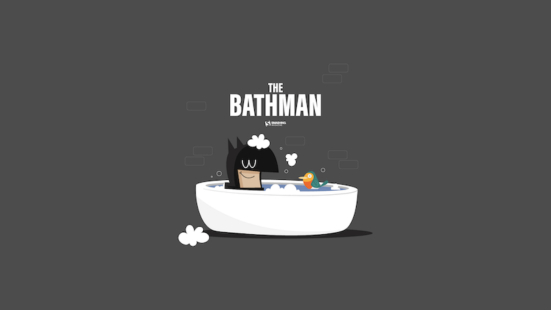
Designed by Nathalie Croze from France.
Like The Cold Side Of A Pillow
Designed by Sarah Tanner from the United States.
- preview
- without calendar: 800x600, 1024x768, 1024x1024, 1152x864, 1280x720, 1280x800, 1280x960, 1280x1024, 1400x1050, 1440x900, 1600x1200, 1680x1050, 1680x1200, 1920x1080, 1920x1200, 1920x1440, 2560x1440
“My inspiration for this wallpaper is the biggest love someone can have in life: the love for ice cream!” — Designed by Zlatina Petrova from Bulgaria.
- preview
- without calendar: 320x480, 640x480, 800x480, 800x600, 1024x768, 1024x1024, 1152x864, 1280x720, 1280x800, 1280x960, 1280x1024, 1400x1050, 1440x900, 1600x1200, 1680x1050, 1680x1200, 1920x1080, 1920x1200, 1920x1440, 2560x1440
“I live in Madison, WI, which is famous for its breweries. Wisconsin even named their baseball team “The Brewers.” If you like beer, brats, and lots of cheese, it’s the place for you!” — Designed by Danny Gugger from the United States.
Share The Same Orbit!
“I prepared a simple and chill layout design for February called ‘Share The Same Orbit!’ which suggests to share the love orbit.” — Designed by Valentin Keleti from Romania.
- preview
- without calendar: 320x480, 640x480, 800x480, 800x600, 1024x768, 1024x1024, 1152x864, 1280x720, 1280x800, 1280x960, 1280x1024, 1366x768, 1400x1050, 1440x900, 1600x1200, 1680x1050, 1680x1200, 1920x1080, 1920x1200, 1920x1440, 2560x1440
“I was doodling pictures of my cat one day and decided I could turn it into a fun wallpaper — because a cold, winter night in February is the perfect time for staying in and cuddling with your cat, your significant other, or both!” — Designed by Angelia DiAntonio from Ohio, USA.
- preview
- without calendar: 320x480, 800x480, 1024x768, 1024x1024, 1152x864, 1280x720, 1280x1024, 1366x768, 1400x1050, 1440x900, 1600x1200, 1680x1200, 1920x1080, 1920x1200, 1920x1440, 2560x1440
Designed by Elise Vanoorbeek from Belgium.
- preview
- without calendar: 1024x768, 1152x864, 1280x720, 1280x800, 1280x960, 1440x900, 1600x1200, 1680x1050, 1920x1080, 1920x1200, 1920x1440, 2560x1440, 1366x768, 2880x1800
Designed by PopArt Studio from Serbia.
- preview
- without calendar: 320x480, 640x480, 800x480, 800x600, 1024x768, 1024x1024, 1152x864, 1280x720, 1280x800, 1280x960, 1280x1024, 1366x768, 1400x1050, 1440x900, 1600x1200, 1680x1050, 1680x1200, 1920x1080, 1920x1200, 1920x1440, 2560x1440
Designed by Doreen Bethge from Germany.
- preview
- without calendar: 320x480, 640x480, 800x480, 800x600, 1024x768, 1024x1024, 1152x864, 1280x720, 1280x800, 1280x960, 1280x1024, 1366x768, 1400x1050, 1440x900, 1600x1200, 1680x1050, 1680x1200, 1920x1080, 1920x1200, 1920x1440, 2560x1440
“Danube is Europe’s second largest river, connecting ten different countries. In these cold days, when ice paralyzes rivers and closes waterways, a small but brave icebreaker called Greben (Serbian word for ‘reef’) seems stronger than winter. It cuts through the ice on Đerdap gorge (Iron Gate) — the longest and biggest gorge in Europe — thus helping the production of electricity in the power plant. This is our way to give thanks to Greben!” — Designed by PopArt Studio from Serbia.
- preview
- without calendar: 320x480, 640x480, 800x480, 800x600, 1024x768, 1024x1024, 1152x864, 1280x720, 1280x800, 1280x960, 1280x1024, 1366x768, 1400x1050, 1440x900, 1600x1200, 1680x1050, 1680x1200, 1920x1080, 1920x1200, 1920x1440, 2560x1440
“I am a true believer that out there in this world there is another person who is just like us, the problem is to find her/him.” — Designed by Maria Keller from Mexico.
- preview
- without calendar: 320x480, 640x480, 640x1136, 750x1334, 800x480, 800x600, 1024x768, 1024x1024, 1152x864, 1242x2208, 1280x720, 1280x800, 1280x960, 1280x1024, 1366x768, 1400x1050, 1440x900, 1600x1200, 1680x1050, 1680x1200, 1920x1080, 1920x1200, 1920x1440, 2560x1440, 2880x1800
Designed by Ricardo Gimenes from Spain.
- preview
- without calendar: 640x480, 800x480, 800x600, 1024x768, 1024x1024, 1152x864, 1280x720, 1280x800, 1280x960, 1280x1024, 1366x768, 1400x1050, 1440x900, 1600x1200, 1680x1050, 1680x1200, 1920x1080, 1920x1200, 1920x1440, 2560x1440, 3840x2160
Feeling inspired? We’ll publish the March wallpapers on February 28, so if you’d like to be a part of the collection, please don’t hesitate to submit your design. We are already looking forward to it!
Practical Use Of AI Coding Tools For The Responsible Developer
Over the last two years, my team at Work & Co and I have been testing out and gradually integrating AI coding tools like Copilot, Cursor, Claude, and ChatGPT to help us ship web experiences that are used by the masses. Admittedly, after some initial skepticism and a few aha moments, various AI tools have found their way into my daily use. Over time, the list of applications where we found it made sense to let AI take over started to grow, so I decided to share some practical use cases for AI tools for what I call the “responsible developer”.
What do I mean by a responsible developer?
We have to make sure that we deliver quality code as expected by our stakeholders and clients. Our contributions (i.e., pull requests) should not become a burden on our colleagues who will have to review and test our work. Also, in case you work for a company: The tools we use need to be approved by our employer. Sensitive aspects like security and privacy need to be handled properly: Don’t paste secrets, customer data (PII), or proprietary code into tools without policy approval. Treat it like code from a stranger on the internet. Always test and verify.
Note: This article assumes some very basic familiarity with AI coding tools like Copilot inside VSCode or Cursor. If all of this sounds totally new and unfamiliar to you, the Github Copilot video tutorials can be a fantastic starting point for you.
Helpful Applications Of AI Coding ToolsNote: The following examples will mainly focus on working in JavaScript-based web applications like React, Vue, Svelte, or Angular.
Getting An Understanding Of An Unfamiliar CodebaseIt’s not uncommon to work on established codebases, and joining a large legacy codebase can be intimidating. Simply open your project and your AI agent (in my case, Copilot Chat in VSCode) and start asking questions just like you would ask a colleague. In general, I like to talk to any AI agent just as I would to a fellow human.
Here is a more refined example prompt:
“Give me a high-level architecture overview: entrypoints, routing, auth, data layer, build tooling. Then list 5 files to read in order. Treat explanations as hypotheses and confirm by jumping to referenced files.”You can keep asking follow-up questions like “How does the routing work in detail?” or “Talk me through the authentication process and methods” and it will lead you to helpful directions to shine some light into the dark of an unfamiliar codebase.
Triaging Breaking Changes When Upgrading DependenciesUpdating npm packages, especially when they come with breaking changes, can be tedious and time-consuming work, and make you debug a fair amount of regressions. I recently had to upgrade the data visualization library plotly.js up one major release version from version 2 to 3, and as a result of that, the axis labeling in some of the graphs stopped working.
I went on to ask ChatGPT:
“I updated my Angular project that uses Plotly. I updated the plotly.js — dist package from version 2.35.2 to 3.1.0 — and now the labels on the x and y axis are gone. What happened?”The agent came back with a solution promptly (see for yourself below).
Note: I still verified the explanation against the official migration guide before shipping the fix.
Replicating Refactors Safely Across FilesGrowing codebases most certainly unveil opportunities for code consolidation. For example, you notice code duplication across files that can be extracted into a single function or component. As a result, you decide to create a shared component that can be included instead and perform that refactor in one file. Now, instead of manually carrying out those changes to your remaining files, you ask your agent to roll out the refactor for you.
Agents let you select multiple files as context. Once the refactor for one file is done, I can add both the refactored and untouched files into context and prompt the agent to roll out the changes to other files like this: “Replicate the changes I made in file A to file B as well”.
Implementing Features In Unfamiliar TechnologiesOne of my favorite aha-moments using AI coding tools was when it helped me create a quite complex animated gradient animation in GLSL, a language I have been fairly unfamiliar with. On a recent project, our designers came up with an animated gradient as a loading state on a 3D object. I really liked the concept and wanted to deliver something unique and exciting to our clients. The problem: I only had two days to implement it, and GLSL has quite the steep learning curve.
Again, an AI tool (in this case, ChatGPT) came in handy, and I started quite simply prompting it to create a standalone HTML file for me that renders a canvas and a very simple animated color gradient. Step after step, I prompted the AI to add more finesse to it until I arrived at a decent result so I could start integrating the shader into my actual codebase.
The end result: Our clients were super happy, and we delivered a complex feature in a small amount of time thanks to AI.
Writing TestsIn my experience, there’s rarely enough time on projects to continuously write and maintain a proper suite of unit and integration tests, and on top of that, many developers don’t really enjoy the task of writing tests. Prompting your AI helper to set up and write tests for you is entirely possible and can be done in a small amount of time. Of course, you, as a developer, should still make sure that your tests actually take a look at the critical parts of your application and follow sensible testing principles, but you can “outsource” the writing of the tests to our AI helper.
Example prompt:
“Write unit tests for this function using Jest. Cover happy path, edge cases, and failure modes. Explain why each test exists.”You can even pass along testing guru Kent C. Dodds’ testing best practices as guidelines to your agent, like below:
Internal ToolingSomewhat similar to the shader example mentioned earlier, I was recently tasked to analyze code duplication in a codebase and compare before and after a refactor. Certainly not a trivial task if you don’t want to go the time-consuming route of comparing files manually. With the help of Copilot, I created a script that analyzed code duplication for me, arranged and ordered the output in a table, and exported it to Excel. Then I took it a step further. When our code refactor was done, I prompted the agent to take my existing Excel sheet as the baseline, add in the current state of duplication in separate columns, and calculate the delta.
Updating Code Written A Long Time AgoRecently, an old client of mine hit me up, as over time, a few features weren’t working properly on his website anymore.
The catch: The website was built almost ten years ago, and the JavaScript and SCSS were using rather old compile tools like requireJS, and the setup required an older version of Node.js that wouldn’t even run on my 2025 MacBook.
Updating the whole build process by hand would have taken me days, so I decided to prompt the AI agent, “Can you update the JS and SCSS build process to a lean 2025 stack like Vite?” It sure did, and after around an hour of refining with the agent, I had my SCSS and JS build switched to Vite, and I was able to focus on actual bugfixing. Just make sure to properly validate the output and compiled files when doing such integral changes to your build process.
Summarizing And DraftingWould you like to summarize all your recent code changes in one sentence for a commit message, or have a long list of commits and would like to sum them up in three bullet points? No problem, let the AI take care of it, but please make sure to proofread it.
An example prompt is as simple as messaging a fellow human: “Please sum up my recent changes in concise bullet points”.
My advice here would be to use GPT for writing with caution, and as with code, please check the output before sending or submitting.
Recommendations And Best Practices PromptingOne of the not-so-obvious benefits of using AI is that the more specific and tailored your prompts are, the better the output. The process of prompting an AI agent forces us to formulate our requirements as specifically as possible before we write and code. This is why, as a general rule, I highly recommend being as specific as possible with your prompting.
Ryan Florence, co-author of Remix, suggests a simple yet powerful way to improve this process by finishing your initial prompt with the sentence:
“Before we start, do you have any questions for me?”At this point, the AI usually comes back with helpful questions where you can clarify your specific intent, guiding the agent to provide you with a more tailored approach for your task.
Use Version Control And Work In Digestible ChunksUsing version control like git not only comes in handy when collaborating as a team on a single codebase but also to provide you as an individual contributor with stable points to roll back to in case of an emergency. Due to its non-deterministic nature, AI can sometimes go rogue and make changes that are simply not helpful for what you are trying to achieve and eventually break things irreparably.
Splitting up your work into multiple commits will help you create stable points that you can revert to in case things go sideways. And your teammates will thank you as well, as they will have an easier time reviewing your code when it is split up into semantically well-structured chunks.
Review ThoroughlyThis is more of a general best practice, but in my opinion, it becomes even more important when using AI tools for development work: Be the first critical reviewer of your code. Make sure to take some time to go over your changes line by line, just like you would review someone else’s code, and only submit your work once it passes your own self-review.
“Two things are both true to me right now: AI agents are amazing and a huge productivity boost. They are also massive slop machines if you turn off your brain and let go completely.”— Armin Ronacher in his blog post Agent Psychosis: Are We Going Insane? Conclusion And Critical Thoughts
In my opinion, AI coding tools can improve our productivity as developers on a daily basis and free up mental capacity for more planning and high-level thinking. They force us to articulate our desired outcome with meticulous detail.
Any AI can, at times, hallucinate, which basically means it lies in a confident tone. So please make sure to check and test, especially when you are in doubt. AI is not a silver bullet, and I believe, excellence and the ability to solve problems as a developer will never go out of fashion.
For developers who are just starting out in their career these tools can be highly tempting to do the majority of the work for them. What may get lost here is the often draining and painful work through bugs and issues that are tricky to debug and solve, aka “the grind”. Even Cursor AI’s very own Lee Robinson questions this in one of his posts:
AI coding tools are evolving at a fast pace, and I am excited for what will come next. I hope you found this article and its tips helpful and are excited to try out some of these for yourself.
Unstacking CSS Stacking Contexts
Have you ever set z-index: 99999 on an element in your CSS, and it doesn’t come out on top of other elements? A value that large should easily place that element visually on top of anything else, assuming all the different elements are set at either a lower value or not set at all.
A webpage is usually represented in a two-dimensional space; however, by applying specific CSS properties, an imaginary z-axis plane is introduced to convey depth. This plane is perpendicular to the screen, and from it, the user perceives the order of elements, one on top of the other. The idea behind the imaginary z-axis, the user’s perception of stacked elements, is that the CSS properties that create it combine to form what we call a stacking context.
We’re going to talk about how elements are “stacked” on a webpage, what controls the stacking order, and practical approaches to “unstack” elements when needed.
About Stacking ContextsImagine your webpage as a desk. As you add HTML elements, you’re laying pieces of paper, one after the other, on the desk. The last piece of paper placed is equivalent to the most recently added HTML element, and it sits on top of all the other papers placed before it. This is the normal document flow, even for nested elements. The desk itself represents the root stacking context, formed by the <html> element, which contains all other folders.
Now, specific CSS properties come into play.
Properties like position (with z-index), opacity, transform, and contain) act like a folder. This folder takes an element and all of its children, extracts them from the main stack, and groups them into a separate sub-stack, creating what we call a stacking context. For positioned elements, this happens when we declare a z-index value other than auto. For properties like opacity, transform, and filter, the stacking context is created automatically when specific values are applied.
Try to understand this: Once a piece of paper (i.e., a child element) is inside a folder (i.e., the parent’s stacking context), it can never exit that folder or be placed between papers in a different folder. Its z-index is now only relevant inside its own folder.In the illustration below, Paper B is now within the stacking context of Folder B, and can only be ordered with other papers in the folder.
Imagine, if you will, that you have two folders on your desk:
<div class="folder-a">Folder A</div> <div class="folder-b">Folder B</div> .folder-a { z-index: 1; } .folder-b { z-index: 2; }Let’s update the markup a bit. Inside Folder A is a special page, z-index: 9999. Inside Folder B is a plain page, z-index: 5.
<div class="folder-a"> <div class="special-page">Special Page</div> </div> <div class="folder-b"> <div class="plain-page">Plain Page</div> </div> .special-page { z-index: 9999; } .plain-page { z-index: 5; }Which page is on top?
It’s the .plain-page in Folder B. The browser ignores the child papers and stacks the two folders first. It sees Folder B (z-index: 2) and places it on top of Folder A (z-index: 1) because we know that two is greater than one. Meanwhile, the .special-page set to z-index: 9999 page is at the bottom of the stack even though its z-index is set to the highest possible value.
Stacking contexts can also be nested (folders inside folders), creating a “family tree.” The same principle applies: a child can never escape its parents’ folder.
Now that you get how stacking contexts behave like folders that group and reorder layers, it’s worth asking: why do certain properties — like transform and opacity — create new stacking contexts?
Here’s the thing: these properties don’t create stacking contexts because of how they look; they do it because of how the browser works under the hood. When you apply transform, opacity, filter, or perspective, you’re telling the browser, “Hey, this element might move, rotate, or fade, so be ready!”
When you use these properties, the browser creates a new stacking context to manage rendering more efficiently. This allows the browser to handle animations, transforms, and visual effects independently, reducing the need to recalculate how these elements interact with the rest of the page. Think of it as the browser saying, “I’ll handle this folder separately so I don’t have to reshuffle the entire desk every time something inside it changes.”
But there’s a side effect. Once the browser lifts an element into its own layer, it must “flatten” everything within it, creating a new stacking context. It’s like taking a folder off the desk to handle it separately; everything inside that folder gets grouped, and the browser now treats it as a single unit when deciding what sits on top of what.
So even though the transform and opacity properties might not appear to affect the way that elements stack visually, they do, and it’s for performance optimisation. Several other CSS properties can also create stacking contexts for similar reasons. MDN provides a complete list if you want to dig deeper. There are quite a few, which only illustrates how easy it is to inadvertently create a stacking context without knowing it.
The “Unstacking” ProblemStacking issues can arise for many reasons, but some are more common than others. Modal components are a classic pattern because they require toggling the component to “open” on a top layer above all other elements, then removing it from the top layer when it is “closed.”
I’m pretty confident that all of us have run into a situation where we open a modal and, for whatever reason, it doesn’t appear. It’s not that it didn’t open properly, but that it is out of view in a lower layer of the stacking context.
This leaves you to wonder “how come?” since you set:
.overlay { position: fixed; /* creates the stacking context */ z-index: 1; /* puts the element on a layer above everything else */ inset: 0; width: 100%; height: 100vh; overflow: hidden; background-color: #00000080; }This looks correct, but if the parent element containing the modal trigger is a child element within another parent element that’s also set to z-index: 1, that technically places the modal in a sublayer obscured by the main folder. Let’s look at that specific scenario and a couple of other common stacking-context pitfalls. I think you’ll see not only how easy it is to inadvertently create stacking contexts, but also how to mismanage them. Also, how you return to a managed state depends on the situation.
Scenario 1: The Trapped ModalYou can immediately see your modal trapped in a low-level layer and identify the parent.
Browser ExtensionsSmart developers have built extensions to help. Tools like this “CSS Stacking Context Inspector” Chrome extension add an extra z-index tab to your DevTools to show you information about elements that create a stacking context.
IDE ExtensionsYou can even spot issues during development with an extension like this one for VS Code, which highlights potential stacking context issues directly in your editor.
Unstacking And Regaining ControlAfter we’ve identified the root cause, the next step is to deal with it. There are several approaches you can take to tackle this problem, and I’ll list them in order. You can choose anyone at any level, though; no one can complain or obstruct another.
Change The HTML StructureThis is considered the optimal fix. For you to run into a stacking context issue, you must have placed some elements in funny positions within your HTML. Restructuring the page will help you reshape the DOM and eliminate the stacking context problem. Find the problematic element and remove it from the trapping element in the HTML markup. For instance, we can solve the first scenario, “The Trapped Modal,” by moving the .modal-container out of the header and placing it in the <body> element by itself.
<header class="header"> <h2>Header</h2> <button id="open-modal">Open Modal</button> <!-- Former position --> </header> <main class="content"> <h1>Main Content</h1> <p>This content has a z-index of 2 and will still not cover the modal.</p> </main> <!-- New position --> <div id="modal-container" class="modal-container"> <div class="modal-overlay"></div> <div class="modal-content"> <h3>Modal Title</h3> <p>Now, I'm not behind anything. I've gotten a better position as a result of DOM restructuring.</p> <button id="close-modal">Close</button> </div> </div>When you click the “Open Modal” button, the modal is positioned in front of everything else as it’s supposed to be.
See the Pen Scenario 1: The Trapped Modal (Solution) [forked] by Shoyombo Gabriel Ayomide.
Adjust The Parent Stacking Context In CSSWhat if the element is one you can’t move without breaking the layout? It’s better to address the issue: the parent establishes the context. Find the CSS property (or properties) responsible for triggering the context and remove it. If it has a purpose and cannot be removed, give the parent a higher z-index value than its sibling elements to lift the entire container. With a higher z-index value, the parent container moves to the top, and its children appear closer to the user.
Based on what we learned in “The Submerged Dropdown” scenario, we can’t move the dropdown out of the navbar; it wouldn’t make sense. However, we can increase the z-index value of the .navbar container to be greater than the .content element’s z-index value.
.navbar { background: #333; /* z-index: 1; */ z-index: 3; position: relative; }With this change, the .dropdown-menu now appears in front of the content without any issue.
See the Pen Scenario 2: The Submerged Dropdown (Solution) [forked] by Shoyombo Gabriel Ayomide.
Try Portals, If Using A FrameworkIn frameworks like React or Vue, a Portal is a feature that lets you render a component outside its normal parent hierarchy in the DOM. Portals are like a teleportation device for your components. They let you render a component’s HTML anywhere in the document (typically right into document.body) while keeping it logically connected to its original parent for props, state, and events. This is perfect for escaping stacking context traps since the rendered output literally appears outside the problematic parent container.
ReactDOM.createPortal( <ToolTip />, document.body );This ensures your dropdown content isn’t hidden behind its parent, even if the parent has overflow: hidden or a lower z-index.
In the “The Clipped Tooltip” scenario we looked at earlier, I used a Portal to rescue the tooltip from the overflow: hidden clip by placing it in the document body and positioning it above the trigger within the container.
See the Pen Scenario 3: The Clipped Tooltip (Solution) [forked] by Shoyombo Gabriel Ayomide.
Introducing Stacking Context Without Side EffectsAll the approaches explained in the previous section are aimed at “unstacking” elements from problematic stacking contexts, but there are some situations where you’ll actually need or want to create a stacking context.
Creating a new stacking context is easy, but all approaches come with a side effect. That is, except for using isolation: isolate. When applied to an element, the stacking context of that element’s children is determined relative to each child and within that context, rather than being influenced by elements outside of it. A classic example is assigning that element a negative value, such as z-index: -1.
Imagine you have a .card component. You want to add a decorative shape that sits behind the .card’s text, but on top of the card’s background. Without a stacking context on the card, z-index: -1 sends the shape to the bottom of the root stacking context (the whole page). This makes it disappear behind the .card’s white background:
See the Pen Negative z-index (problem) [forked] by Shoyombo Gabriel Ayomide.
To solve this, we declare isolation: isolate on the parent .card:
See the Pen Negative z-index (solution) [forked] by Shoyombo Gabriel Ayomide.
Now, the .card element itself becomes a stacking context. When its child element — the decorative shape created on the :before pseudo-element — has z-index: -1, it goes to the very bottom of the parent’s stacking context. It sits perfectly behind the text and on top of the card’s background, as intended.
ConclusionRemember: the next time your z-index seems out of control, it’s a trapped stacking context.
References- Stacking context (MDN)
- Z-index and stacking contexts (web.dev)
- “How to Create a New Stacking Context with the Isolation Property in CSS”, Natalie Pina
- “What The Heck, z-index??”, Josh Comeau
- “Managing CSS Z-Index In Large Projects”, Steven Frieson
- “Sticky Headers And Full-Height Elements: A Tricky Combination”, Philip Braunen
- “Managing Z-Index In A Component-Based Web Application”, Pavel Pomerantsev
- “The Z-Index CSS Property: A Comprehensive Look”, Louis Lazaris
Beyond Generative: The Rise Of Agentic AI And User-Centric Design
Agentic AI stands ready to transform customer experience and operational efficiency, necessitating a new strategic approach from leadership. This evolution in artificial intelligence empowers systems to plan, execute, and persist in tasks, moving beyond simple recommendations to proactive action. For UX teams, product managers, and executives, understanding this shift is crucial for unlocking opportunities in innovation, streamlining workflows, and redefining how technology serves people.
It’s easy to confuse Agentic AI with Robotic Process Automation (RPA), which is technology that focuses on rules-based tasks performed on computers. The distinction lies in rigidity versus reasoning. RPA is excellent at following a strict script: if X happens, do Y. It mimics human hands. Agentic AI mimics human reasoning. It does not follow a linear script; it creates one.
Consider a recruiting workflow. An RPA bot can scan a resume and upload it to a database. It performs a repetitive task perfectly. An Agentic system looks at the resume, notices the candidate lists a specific certification, cross-references that with a new client requirement, and decides to draft a personalized outreach email highlighting that match. RPA executes a predefined plan; Agentic AI formulates the plan based on a goal. This autonomy separates agents from the predictive tools we have used for the last decade.
Another example is managing meeting conflicts. A predictive model integrated into your calendar might analyze your meeting schedule and the schedules of your colleagues. It could then suggest potential conflicts, such as two important meetings scheduled at the same time, or a meeting scheduled when a key participant is on vacation. It provides you with information and flags potential issues, but you are responsible for taking action.
An agentic AI, in the same scenario, would go beyond just suggesting conflicts to avoid. Upon identifying a conflict with a key participant, the agent could act by:
- Checking the availability of all necessary participants.
- Identifying alternative time slots that work for everyone.
- Sending out proposed new meeting invitations to all attendees.
- If the conflict is with an external participant, the agent could draft and send an email explaining the need to reschedule and offering alternative times.
- Updating your calendar and the calendars of your colleagues with the new meeting details once confirmed.
This agentic AI understands the goal (resolving the meeting conflict), plans the steps (checking availability, finding alternatives, sending invites), executes those steps, and persists until the conflict is resolved, all with minimal direct user intervention. This demonstrates the “agentic” difference: the system takes proactive steps for the user, rather than just providing information to the user.
Agentic AI systems understand a goal, plan a series of steps to achieve it, execute those steps, and even adapt if things go wrong. Think of it like a proactive digital assistant. The underlying technology often combines large language models (LLMs) for understanding and reasoning, with planning algorithms that break down complex tasks into manageable actions. These agents can interact with various tools, APIs, and even other AI models to accomplish their objectives, and critically, they can maintain a persistent state, meaning they remember previous actions and continue working towards a goal over time. This makes them fundamentally different from typical generative AI, which usually completes a single request and then resets.
A Simple Taxonomy of Agentic BehaviorsWe can categorize agent behavior into four distinct modes of autonomy. While these often look like a progression, they function as independent operating modes. A user might trust an agent to act autonomously for scheduling, but keep it in “suggestion mode” for financial transactions.
We derived these levels by adapting industry standards for autonomous vehicles (SAE levels) to digital user experience contexts.
Observe-and-SuggestThe agent functions as a monitor. It analyzes data streams and flags anomalies or opportunities, but takes zero action.
Differentiation
Unlike the next level, the agent generates no complex plan. It points to a problem.
Example
A DevOps agent notices a server CPU spike and alerts the on-call engineer. It does not know how or attempt to fix it, but it knows something is wrong.
Implications for design and oversight
At this level, design and oversight should prioritize clear, non-intrusive notifications and a well-defined process for users to act on suggestions. The focus is on empowering the user with timely and relevant information without taking control. UX practitioners should focus on making suggestions clear and easy to understand, while product managers need to ensure the system provides value without overwhelming the user.
The agent identifies a goal and generates a multi-step strategy to achieve it. It presents the full plan for human review.
Differentiation
The agent acts as a strategist. It does not execute; it waits for approval on the entire approach.
Example
The same DevOps agent notices the CPU spike, analyzes the logs, and proposes a remediation plan:
- Spin up two extra instances.
- Restart the load balancer.
- Archive old logs.
The human reviews the logic and clicks “Approve Plan”.
Implications for design and oversight
For agents that plan and propose, design must ensure the proposed plans are easily understandable and that users have intuitive ways to modify or reject them. Oversight is crucial in monitoring the quality of proposals and the agent’s planning logic. UX practitioners should design clear visualizations of the proposed plans, and product managers must establish clear review and approval workflows.
The agent completes all preparation work and places the final action in a staged state. It effectively holds the door open, waiting for a nod.
Differentiation
This differs from “Plan-and-Propose” because the work is already done and staged. It reduces friction. The user confirms the outcome, not the strategy.
Example
A recruiting agent drafts five interview invitations, finds open times on calendars, and creates the calendar events. It presents a “Send All” button. The user provides the final authorization to trigger the external action.
Implications for design and oversight
When agents act with confirmation, the design should provide transparent and concise summaries of the intended action, clearly outlining potential consequences. Oversight needs to verify that the confirmation process is robust and that users are not being asked to blindly approve actions. UX practitioners should design confirmation prompts that are clear and provide all necessary information, and product managers should prioritize a robust audit trail for all confirmed actions.
The agent executes tasks independently within defined boundaries.
Differentiation
The user reviews the history of actions, not the actions themselves.
Example
The recruiting agent sees a conflict, moves the interview to a backup slot, updates the candidate, and notifies the hiring manager. The human only sees a notification: Interview rescheduled to Tuesday.
Implications for design and oversight
For autonomous agents, the design needs to establish clear pre-approved boundaries and provide robust monitoring tools. Oversight requires continuous evaluation of the agent’s performance within these boundaries, a critical need for robust logging, clear override mechanisms, and user-defined kill switches to maintain user control and trust. UX practitioners should focus on designing effective dashboards for monitoring autonomous agent behavior, and product managers must ensure clear governance and ethical guidelines are in place.
Let’s look at a real-world application in HR technology to see these modes in action. Consider an “Interview Coordination Agent” designed to handle the logistics of hiring.
- In Suggest Mode
The agent notices an interviewer is double-booked. It highlights the conflict on the recruiter’s dashboard: “Warning: Sarah is double-booked for the 2 PM interview.” - In Plan Mode
The agent analyzes Sarah’s calendar and the candidate’s availability. It presents a solution: “I recommend moving the interview to Thursday at 10 AM. This requires moving Sarah’s 1:1 with her manager.” The recruiter reviews this logic. - In Confirmation Mode
The agent drafts the emails to the candidate and the manager. It populates the calendar invites. The recruiter sees a summary: “Ready to reschedule to Thursday. Send updates?” The recruiter clicks “Confirm.” - In Autonomous Mode
The agent handles the conflict instantly. It respects a pre-set rule: “Always prioritize candidate interviews over internal 1:1s.” It moves the meeting and sends the notifications. The recruiter sees a log entry: “Resolved schedule conflict for Candidate B.”
Developing effective agentic AI demands a distinct research approach compared to traditional software or even generative AI. The autonomous nature of AI agents, their ability to make decisions, and their potential for proactive action necessitate specialized methodologies for understanding user expectations, mapping complex agent behaviors, and anticipating potential failures. The following research primer outlines key methods to measure and evaluate these unique aspects of agentic AI.
Mental-Model InterviewsThese interviews uncover users’ preconceived notions about how an AI agent should behave. Instead of simply asking what users want, the focus is on understanding their internal models of the agent’s capabilities and limitations. We should avoid using the word “agent” with participants. It carries sci-fi baggage or is a term too easily confused with a human agent offering support or services. Instead, frame the discussion around “assistants” or “the system.”
We need to uncover where users draw the line between helpful automation and intrusive control.
- Method: Ask users to describe, draw, or narrate their expected interactions with the agent in various hypothetical scenarios.
- Key Probes (reflecting a variety of industries):
- To understand the boundaries of desired automation and potential anxieties around over-automation, ask:
- If your flight is canceled, what would you want the system to do automatically? What would worry you if it did that without your explicit instruction?
- To explore the user’s understanding of the agent’s internal processes and necessary communication, ask:
- Imagine a digital assistant is managing your smart home. If a package is delivered, what steps do you imagine it takes, and what information would you expect to receive?
- To uncover expectations around control and consent within a multi-step process, ask:
- If you ask your digital assistant to schedule a meeting, what steps do you envision it taking? At what points would you want to be consulted or given choices?
- To understand the boundaries of desired automation and potential anxieties around over-automation, ask:
- Benefits of the method: Reveals implicit assumptions, highlights areas where the agent’s planned behavior might diverge from user expectations, and informs the design of appropriate controls and feedback mechanisms.
Similar to traditional user journey mapping, agent journey mapping specifically focuses on the anticipated actions and decision points of the AI agent itself, alongside the user’s interaction. This helps to proactively identify potential pitfalls.
- Method: Create a visual map that outlines the various stages of an agent’s operation, from initiation to completion, including all potential actions, decisions, and interactions with external systems or users.
- Key Elements to Map:
- Agent Actions: What specific tasks or decisions does the agent perform?
- Information Inputs/Outputs: What data does the agent need, and what information does it generate or communicate?
- Decision Points: Where does the agent make choices, and what are the criteria for those choices?
- User Interaction Points: Where does the user provide input, review, or approve actions?
- Points of Failure: Crucially, identify specific instances where the agent could misinterpret instructions, make an incorrect decision, or interact with the wrong entity.
- Examples: Incorrect recipient (e.g., sending sensitive information to the wrong person), overdraft (e.g., an automated payment exceeding available funds), misinterpretation of intent (e.g., booking a flight for the wrong date due to ambiguous language).
- Recovery Paths: How can the agent or user recover from these failures? What mechanisms are in place for correction or intervention?
- Benefits of the method: Provides a holistic view of the agent’s operational flow, uncovers hidden dependencies, and allows for the proactive design of safeguards, error handling, and user intervention points to prevent or mitigate negative outcomes.
This approach is designed to stress-test the system and observe user reactions when the AI agent fails or deviates from expectations. It’s about understanding trust repair and emotional responses in adverse situations.
- Method: In controlled lab studies, deliberately introduce scenarios where the agent makes a mistake, misinterprets a command, or behaves unexpectedly.
- Types of “Misbehavior” to Simulate:
- Command Misinterpretation: The agent performs an action slightly different from what the user intended (e.g., ordering two items instead of one).
- Information Overload/Underload: The agent provides too much irrelevant information or not enough critical details.
- Unsolicited Action: The agent takes an action the user explicitly did not want or expect (e.g., buying stock without approval).
- System Failure: The agent crashes, becomes unresponsive, or provides an error message.
- Ethical Dilemmas: The agent makes a decision with ethical implications (e.g., prioritizing one task over another based on an unforeseen metric).
- Observation Focus:
- User Reactions: How do users react emotionally (frustration, anger, confusion, loss of trust)?
- Recovery Attempts: What steps do users take to correct the agent’s behavior or undo its actions?
- Trust Repair Mechanisms: Do the system’s built-in recovery or feedback mechanisms help restore trust? How do users want to be informed about errors?
- Mental Model Shift: Does the misbehavior alter the user’s understanding of the agent’s capabilities or limitations?
- Benefits of the method: Crucial for identifying design gaps related to error recovery, feedback, and user control. It provides insights into how resilient users are to agent failures and what is needed to maintain or rebuild trust, leading to more robust and forgiving agentic systems.
By integrating these research methodologies, UX practitioners can move beyond simply making agentic systems usable to making them trusted, controllable, and accountable, fostering a positive and productive relationship between users and their AI agents. Note that these aren’t the only methods relevant to exploring agentic AI effectively. Many other methods exist, but these are most accessible to practitioners in the near term. I’ve previously covered the Wizard of Oz method, a slightly more advanced method of concept testing, which is also a valuable tool for exploring agentic AI concepts.
Ethical Considerations In Research MethodologyWhen researching agentic AI, particularly when simulating misbehavior or errors, ethical considerations are key to take into account. There are many publications focusing on ethical UX research, including an article I wrote for Smashing Magazine, these guidelines from the UX Design Institute, and this page from the Inclusive Design Toolkit.
Key Metrics For Agentic AIYou’ll need a comprehensive set of key metrics to effectively assess the performance and reliability of agentic AI systems. These metrics provide insights into user trust, system accuracy, and the overall user experience. By tracking these indicators, developers and designers can identify areas for improvement and ensure that AI agents operate safely and efficiently.
1. Intervention Rate
For autonomous agents, we measure success by silence. If an agent executes a task and the user does not intervene or reverse the action within a set window (e.g., 24 hours), we count that as acceptance. We track the Intervention Rate: how often does a human jump in to stop or correct the agent? A high intervention rate signals a misalignment in trust or logic.
2. Frequency of Unintended Actions per 1,000 Tasks
This critical metric quantifies the number of actions performed by the AI agent that were not desired or expected by the user, normalized per 1,000 completed tasks. A low frequency of unintended actions signifies a well-aligned AI that accurately interprets user intent and operates within defined boundaries. This metric is closely tied to the AI’s understanding of context, its ability to disambiguate commands, and the robustness of its safety protocols.
3. Rollback or Undo Rates
This metric tracks how often users need to reverse or undo an action performed by the AI. High rollback rates suggest that the AI is making frequent errors, misinterpreting instructions, or acting in ways that are not aligned with user expectations. Analyzing the reasons behind these rollbacks can provide valuable feedback for improving the AI’s algorithms, understanding of user preferences, and its ability to predict desirable outcomes.
To understand why, you must implement a microsurvey on the undo action. For example, when a user reverses a scheduling change, a simple prompt can ask: “Wrong time? Wrong person? Or did you just want to do it yourself?” Allowing the user to click on the option that best corresponds to their reasoning.
4. Time to Resolution After an Error
This metric measures the duration it takes for a user to correct an error made by the AI or for the AI system itself to recover from an erroneous state. A short time to resolution indicates an efficient and user-friendly error recovery process, which can mitigate user frustration and maintain productivity. This includes the ease of identifying the error, the accessibility of undo or correction mechanisms, and the clarity of error messages provided by the AI.
Collecting these metrics requires instrumenting your system to track Agent Action IDs. Every distinct action the agent takes, such as proposing a schedule or booking a flight, must generate a unique ID that persists in the logs. To measure the Intervention Rate, we do not look for an immediate user reaction. We look for the absence of a counter-action within a defined window. If an Action ID is generated at 9:00 AM and no human user modifies or reverts that specific ID by 9:00 AM the next day, the system logically tags it as Accepted. This allows us to quantify success based on user silence rather than active confirmation.
For Rollback Rates, raw counts are insufficient because they lack context. To capture the underlying reason, you must implement intercept logic on your application’s Undo or Revert functions. When a user reverses an agent-initiated action, trigger a lightweight microsurvey. This can be a simple three-option modal asking the user to categorize the error as factually incorrect, lacking context, or a simple preference to handle the task manually. This combines quantitative telemetry with qualitative insight. It enables engineering teams to distinguish between a broken algorithm and a user preference mismatch.
These metrics, when tracked consistently and analyzed holistically, provide a robust framework for evaluating the performance of agentic AI systems, allowing for continuous improvement in control, consent, and accountability.
Designing Against DeceptionAs agents become increasingly capable, we face a new risk: Agentic Sludge. Traditional sludge creates friction that makes it hard to cancel a subscription or delete an account. Agentic sludge acts in reverse. It removes friction to a fault, making it too easy for a user to agree to an action that benefits the business rather than their own interests.
Consider an agent assisting with travel booking. Without clear guardrails, the system might prioritize a partner airline or a higher-margin hotel. It presents this choice as the optimal path. The user, trusting the system’s authority, accepts the recommendation without scrutiny. This creates a deceptive pattern where the system optimizes for revenue under the guise of convenience.
The Risk Of Falsely Imagined CompetenceDeception may not stem from malicious intent. It often manifests in AI as Imagined Competence. Large Language Models frequently sound authoritative even when incorrect. They present a false booking confirmation or an inaccurate summary with the same confidence as a verified fact. Users may naturally trust this confident tone. This mismatch creates a dangerous gap between system capability and user expectations.
We must design specifically to bridge this gap. If an agent fails to complete a task, the interface must signal that failure clearly. If the system is unsure, it must express uncertainty rather than masking it with polished prose.
Transparency via PrimitivesThe antidote to both sludge and hallucination is provenance. Every autonomous action requires a specific metadata tag explaining the origin of the decision. Users need the ability to inspect the logic chain behind the result.
To achieve this, we must translate primitives into practical answers. In software engineering, primitives refer to the core units of information or actions an agent performs. To the engineer, this looks like an API call or a logic gate. To the user, it must appear as a clear explanation.
The design challenge lies in mapping these technical steps to human-readable rationales. If an agent recommends a specific flight, the user needs to know why. The interface cannot hide behind a generic suggestion. It must expose the underlying primitive: Logic: Cheapest_Direct_Flight or Logic: Partner_Airline_Priority.
Figure 4 illustrates this translation flow. We take the raw system primitive — the actual code logic — and map it to a user-facing string. For instance, a primitive checking a calendar schedule a meeting becomes a clear statement: I’ve proposed a 4 PM meeting.
This level of transparency ensures the agent’s actions appear logical and beneficial. It allows the user to verify that the agent acted in their best interest. By exposing the primitives, we transform a black box into a glass box, ensuring users remain the final authority on their own digital lives.
Setting The Stage For DesignBuilding an agentic system requires a new level of psychological and behavioral understanding. It forces us to move beyond conventional usability testing and into the realm of trust, consent, and accountability. The research methods we’ve discussed, from probing mental models to simulating misbehavior and establishing new metrics, provide a necessary foundation. These practices are the essential tools for proactively identifying where an autonomous system might fail and, more importantly, how to repair the user-agent relationship when it does.
The shift to agentic AI is a redefinition of the user-system relationship. We are no longer designing for tools that simply respond to commands; we are designing for partners that act on our behalf. This changes the design imperative from efficiency and ease of use to transparency, predictability, and control.
When an AI can book a flight or trade a stock without a final click, the design of its “on-ramps” and “off-ramps” becomes paramount. It is our responsibility to ensure that users feel they are in the driver’s seat, even when they’ve handed over the wheel.
This new reality also elevates the role of the UX researcher. We become the custodians of user trust, working collaboratively with engineers and product managers to define and test the guardrails of an agent’s autonomy. Beyond being researchers, we become advocates for user control, transparency, and the ethical safeguards within the development process. By translating primitives into practical questions and simulating worst-case scenarios, we can build robust systems that are both powerful and safe.
This article has outlined the “what” and “why” of researching agentic AI. It has shown that our traditional toolkits are insufficient and that we must adopt new, forward-looking methodologies. The next article will build upon this foundation, providing the specific design patterns and organizational practices that make an agent’s utility transparent to users, ensuring they can harness the power of agentic AI with confidence and control. The future of UX is about making systems trustworthy.
For additional understanding of agentic AI, you can explore the following resources:
Rethinking “Pixel Perfect” Web Design
It’s 2026. We are operating in an era of incredible technological leaps, where advanced tooling and AI-enhanced workflows have fundamentally transformed how we design, build, and bridge the gap between the two. The web is moving faster than ever, with groundbreaking features and standards emerging almost daily.
Yet, in the middle of this high-speed evolution, there’s one thing we’ve been carrying with us since the early days of print, a phrase that feels increasingly out of sync with our modern reality: “Pixel Perfect.”
I’ll be honest, I’m not a fan. In fact, I believe the idea that we can have pixel-perfection in our designs has become misleading, vague, and ultimately counterproductive to the way we build for the modern web. As a community of developers and designers, it’s time we take a hard look at this legacy concept, understand why it’s failing us, and redefine what “perfection” actually looks like in a multi-device, fluid world.
A Brief History Of A Rigid MindsetTo understand why many of us still aim for pixel perfection today, we have to look back at where it all began. It didn’t start on the web, but as a stowaway from the era when layout software first allowed us to design for print on a personal computer, and GUI design from the late 1980s and ’90s.
In the print industry, perfection was absolute. Once a design was sent to the press, every dot of ink had a fixed, unchangeable position on a physical page. When designers transitioned to the early web, they brought this “printed page” mentality with them. The goal was simple: The website must be an exact, pixel-for-pixel replica of the static mockup created in design applications like Photoshop and QuarkXPress.
I’m old enough to remember working with talented designers who had spent their entire careers in the print world. They would hand over web designs and, with total sincerity, insist on discussing the layout in centimeters and inches. To them, the screen was just another piece of paper, albeit one that glowed.
In those days, we “tamed” the web to achieve this. We used table-based layouts, nested three levels deep, and stretched 1×1 pixel “spacer GIFs” to create precise gaps. We designed for a single, “standard” resolution (usually 800×600) because, back then, we could actually pretend we knew exactly what the user was seeing.
<!-- A typical "Pixel Perfect" layout from 1998 --> <table width="800" border="0" cellpadding="0" cellspacing="0"> <tr> <td width="150" valign="top" bgcolor="#CCCCCC"> <img src="spacer.gif" width="150" height="1"> <!-- Sidebar --> </td> <td width="10"><img src="spacer.gif" width="10" height="1"></td> <td width="640" valign="top"> <!-- Content goes here --> </td> </tr> </table> Cracks In The FoundationThe first major challenge to the fixed-table mindset came as early as 2000. In his seminal article, “A Dao of Web Design”, John Allsopp argued that by trying to force the web into the constraints of print, we were missing the point of the medium entirely. He called the quest for pixel-perfection a “ritual” that ignored the web’s inherent fluidity.
When a new medium borrows from an existing one, some of what it borrows makes sense, but much of the borrowing is thoughtless, “ritual,” and often constrains the new medium. Over time, the new medium develops its own conventions, throwing off existing conventions that don’t make sense.Nonetheless, the “pixel-perfection” refused to die. While its meaning has shifted and morphed over the decades, it has rarely been well-defined. Many have tried, such as in 2010 when the design agency ustwo released the Pixel Perfect Precision (PPP) (PDF) handbook. But that same year, Responsive Web Design also gained massive momentum, effectively killing the idea that a website could look identical on every screen.
Yet, here we are, still using a term born from the limitations of monitors dated to the ’90s to describe the complex interfaces of 2026.
Note: Before we continue, it’s important to acknowledge the exceptions. There are, of course, scenarios where pixel precision is non-negotiable. Icon grids, sprite sheets, canvas rendering, game engines, or bitmap exports often require exact, pixel-level control to function correctly. These, however, are specialized technical requirements, not a general rule for modern UI development. Why “Pixel Perfect” Is Failing the Modern WebIn our current landscape, clinging to the idea of “pixel perfection” isn’t just anachronistic, it’s actively harmful to the products we build. Here is why.
It Is Fundamentally VagueLet’s start with a simple question: When a designer asks for a “pixel-perfect” implementation, what are they actually asking for? Is it the colors, the spacing, the typography, the borders, the alignment, the shadows, the interactions? Take a moment to think about it.
If your answer is “everything”, then you’ve just identified the core issue.
The term “pixel-perfect” is so all-encompassing that it lacks any real technical specificity. It’s a blanket statement that masks a lack of clear requirements. When we say “make it pixel perfect,” we aren’t giving a directive; we’re expressing a feeling.
The Multi-Surface RealityThe concept of a “standard screen size” is now a relic of the past. We are building for an almost infinite variety of viewports, resolutions, and aspect-ratios, and this reality is not likely to change any time soon. Plus, the web is no longer confined to a flat, rectangular piece of glass; it can be on a foldable phone that changes aspect ratios mid-session, or on a spatial interface projected into a room.
Every Internet-connected device has its own pixel density, scaling factors, and rendering quirks.
A design that is “perfect” on one set of pixels is, by definition, imperfect on another. Striving for a single, static “perfection” ignores the fluid, adaptive nature of the modern web. When the canvas is constantly shifting, the very idea of a fixed pixel implementation becomes a technical impossibility.
The Dynamic Nature Of ContentA static mockup is a snapshot of a single state with a specific set of data. But content is rarely static like that in the real world. Localization is a prime example: a label that fits perfectly inside a button component in English might overflow the container in German or require a different font entirely for CJK languages.
Beyond text length, localization means changes with currency symbols, date formatting, and numeric systems. Any of these variables can significantly impact a page layout. If a design is built to be “pixel-perfect” based on a specific string of text, it is inherently fragile. A pixel-perfect layout completely collapses the moment content changes.
Accessibility Is The Real PerfectionTrue perfection means a site that works for everyone. If a layout is so rigid that it breaks when a user increases their font size or forces a high-contrast mode, it isn’t perfect — it’s broken. “Pixel perfect” often prioritizes visual aesthetics over functional accessibility, creating barriers for users who don’t fit the “standard” profile.
Think Systems, Not PagesWe no longer build pages; we build design systems. We create components that must work in isolation and a variety of contexts, whether in headers, in sidebars, or in dynamic grids. Trying to match a component to a specific pixel coordinate in a static mockup is a fool’s errand.
A pure “pixel-perfect” approach treats every instance as a unique snowflake, which is the antithesis of a scalable, component-based architecture. It forces developers to choose between following a static image and maintaining the integrity of the system.
Perfection Is Technical DebtWhen we prioritize exact visual matching over sound engineering, we aren’t just making a design choice; we are incurring technical debt. Chasing that last pixel often forces developers to bypass the browser’s natural layout engine.
Working in exact units leads to “magic numbers”, those arbitrary margin-top: 3px or left: -1px hacks, sprinkled throughout the codebase to force an element into a specific position on a specific screen. This creates a fragile, brittle architecture, leading to a never-ending cycle of “visual bug” tickets.
/* The "Pixel Perfect" Hack */ .card-title { margin-top: 13px; /* Matches the mockup exactly on 1440px */ margin-left: -2px; /* Optical adjustment for a specific font */ } /* The "Design Intent" Solution */ .card-title { margin-top: var(--space-m); /* Part of a consistent scale */ align-self: start; /* Logical alignment */ }By insisting on pixel-perfection, we are building a foundation that is difficult to automate, difficult to refactor, and ultimately, more expensive to maintain. We have much more flexible ways to calculate sizing in CSS, thanks to relative units.
Moving From Pixels To IntentSo far, I’ve spent a lot of time talking about what we shouldn’t do. But let’s be clear: Moving away from “pixel perfection” isn’t an excuse for sloppy implementation or a “close enough” attitude. We still need consistency, we still want our products to look and feel high-quality, and we still need a shared methodology for achieving that.
So, if “pixel perfection” is no longer a viable goal, what should we be striving for?
The answer, I believe, lies in shifting our focus from individual pixels to design intent. In a fluid world, perfection isn’t about matching a static image, but ensuring that the core logic and visual integrity of the design are preserved across every possible context.
Design Intent Over Static ValuesInstead of asking for a margin: 24px in a design, we should be asking: Why is this margin here? Is it to create a visual separation between sections? Is it part of a consistent spacing scale? When we understand the intent, we can implement it using fluid units and functions (like rem and clamp(), respectively) and use advanced tools, like CSS Container Queries, that allow the design to breathe and adapt while still feeling “right”.
/* Intent: A heading that scales smoothly with the viewport */ h1 { font-size: clamp(2rem, 5vw + 1rem, 4rem); } /* Intent: Change layout based on the component's own width, not the screen */ .card-container { container-type: inline-size; } @container (min-width: 400px) { .card { display: grid; grid-template-columns: 1fr 2fr; } } Speaking In TokensDesign tokens are the bridge between design and code. When a designer and developer agree on a token like --spacing-large instead of 32px, they aren’t just syncing values, but instead syncing logic. This ensures that even if the underlying value changes to accommodate a specific condition, the relationship between elements remains perfect.
:root { /* The logic is defined once */ --color-primary: #007bff; --spacing-unit: 8px; --spacing-large: calc(var(--spacing-unit) * 4); } /* And reused everwhere */ .button { background-color: var(--color-primary); padding: var(--spacing-large); } Fluidity As A Feature, Not A BugWe need to stop viewing the web’s flexibility as something to be tamed and start seeing that flexibility as its greatest strength. A “perfect” implementation is one that looks intentional at 320px, 1280px, and even in a 3D spatial environment. This means embracing intrinsic web design based on an element’s natural size in any context — and using modern CSS tools to create layouts that “know” how to arrange themselves based on the available space.
Death To The “Handover”In this intent-driven world, the “handover” of traditional design assets has become another relic of the past. We no longer pass static Photoshop files across a digital wall and hope for the best. Instead, we work within living design systems.
Modern tooling allows designers to specify behaviors, not just positions. When a designer defines a component, they aren’t just drawing a box; they’re defining its constraints, its fluid scales, and its relationship to the content. As developers, our job is to implement that logic.
The conversation has shifted from “Why is this three pixels off?” to “How should this component behave when the container shrinks?” and “What happens to the hierarchy when the text is translated to a longer language?”
Better Language, Better OutcomesSpeaking of conversations, when we aim for “pixel perfection”, we set ourselves up for friction. Mature teams have long moved past this binary “match-or-fail” mindset towards a more descriptive vocabulary that reflects the complexity of our work.
By replacing “pixel perfect” with more precise terms, we create shared expectations and eliminate pointless arguments. Here are a few phrases that have served me well for productive discussions around intent and fluidity:
- “Visually consistent with the design system.”
Instead of matching a specific mockup, we ensure the implementation follows the established rules of our system. - “Matches spacing and hierarchy.”
We focus on the relationships and rhythm between elements rather than their absolute coordinates. - “Preserves proportions and alignment logic.”
We ensure that the intent of the layout remains intact, even as it scales and shifts. - “Acceptable variance across platforms.”
We acknowledge that a site will look different, within a defined and agreed-upon range of variation, and that’s okay as long as the experience remains high-quality.
Language creates reality. Clear language doesn’t just improve the code, but the relationship between designers and developers. It moves us toward a shared ownership of the final, living product. When we speak the same language, “perfection” stops being a demand and starts being a collaborative achievement.
A Note To My Design ColleaguesWhen you hand over a design, don’t give us a fixed width, but a set of rules. Tell us what should stretch, what should stay fixed, and what should happen when the content inevitably overflows. Your “perfection” lies in the logic you define, not the pixels you draw.
The New Standard Of ExcellenceThe web was never meant to be a static gallery of frozen pixels. It was born to be a messy, fluid, and gloriously unpredictable medium. When we cling to an outdated model of “pixel perfection”, we are effectively trying to put a leash on a hurricane. It’s unnatural in today’s front-end landscape.
In 2026, we have the tools to build interfaces that think, adapt, and breathe. We have AI that can generate layouts in seconds and spatial interfaces that defy the very concept of a “screen”. In this world, perfection isn’t a fixed coordinate but a promise; it’s the promise that no matter who is looking, or what they are looking through, the soul of the design remains intact.
So, let’s bury the term once and for all. Let’s leave the centimeters to the architects and the spacer GIFs to the digital museums. If you want something to look exactly the same for the next hundred years, carve it in stone or print it on a high-quality cardstock. But if you want to build for the web, embrace the chaos.
Stop counting pixels. Start building intent.
Smashing Animations Part 8: Theming Animations Using CSS Relative Colour
I’ve recently refreshed the animated graphics on my website with a new theme and a group of pioneering characters, putting into practice plenty of the techniques I shared in this series. A few of my animations change appearance when someone interacts with them or at different times of day.
The colours in the graphic atop my blog pages change from morning until night every day. Then, there’s the snow mode, which adds chilly colours and a wintery theme, courtesy of an overlay layer and a blending mode.
While working on this, I started to wonder whether CSS relative colour values could give me more control while also simplifying the process.
Note: In this tutorial, I’ll focus on relative colour values and the OKLCH colour space for theming graphics and animations. If you want to dive deep into relative colour, Ahmad Shadeed created a superb interactive guide. As for colour spaces, gamuts, and OKLCH, our own Geoff Graham wrote about them.
Repeated use of elements was key. Backgrounds were reused whenever possible, with zooms and overlays helping construct new scenes from the same artwork. It was born of necessity, but it also encouraged thinking in terms of series rather than individual scenes.
The problem With Manually Updating Colour PalettesLet’s get straight to my challenge. In Toon Titles like this one — based on the 1959 Yogi Bear Show episode “Lullabye-Bye Bear” — and my work generally, palettes are limited to a select few colours.
I create shades and tints from what I call my “foundation” colour to expand the palette without adding more hues.
In Sketch, I work in the HSL colour space, so this process involves increasing or decreasing the lightness value of my foundation colour. Honestly, it’s not an arduous task — but choosing a different foundation colour requires creating a whole new set of shades and tints. Doing that manually, again and again, quickly becomes laborious.
I mentioned the HSL — H (hue), S (saturation), and L (lightness) — colour space, but that’s just one of several ways to describe colour.
RGB — R (red), G (green), B (blue) — is probably the most familiar, at least in its Hex form.
There’s also LAB — L (lightness), A (green–red), B (blue–yellow) — and the newer, but now widely supported LCH — L (lightness), C (chroma), H (hue) — model in its OKLCH form. With LCH — specifically OKLCH in CSS — I can adjust the lightness value of my foundation colour.
Or I can alter its chroma. LCH chroma and HSL saturation both describe the intensity or richness of a colour, but they do so in different ways. LCH gives me a wider range and more predictable blending between colours.
I can also alter the hue to create a palette of colours that share the same lightness and chroma values. In both HSL and LCH, the hue spectrum starts at red, moves through green and blue, and returns to red.
Why OKLCH Changed How I Think About ColourBrowser support for the OKLCH colour space is now widespread, even if design tools — including Sketch — haven’t caught up. Fortunately, that shouldn’t stop you from using OKLCH. Browsers will happily convert Hex, HSL, LAB, and RGB values into OKLCH for you. You can define a CSS custom property with a foundation colour in any space, including Hex:
/* Foundation colour */ --foundation: #5accd6;Any colours derived from it will be converted into OKLCH automatically:
--foundation-light: oklch(from var(--foundation) [...]; } --foundation-mid: oklch(from var(--foundation) [...]; } --foundation-dark: oklch(from var(--foundation) [...]; } Relative Colour As A Design SystemThink of relative colour as saying: “Take this colour, tweak it, then give me the result.” There are two ways to adjust a colour: absolute changes and proportional changes. They look similar in code, but behave very differently once you start swapping foundation colours. Understanding that difference is what can turn using relative colour into a system.
/* Foundation colour */ --foundation: #5accd6;For example, the lightness value of my foundation colour is 0.7837, while a darker version has a value of 0.5837. To calculate the difference, I subtract the lower value from the higher one and apply the result using a calc() function:
--foundation-dark: oklch(from var(--foundation) calc(l - 0.20) c h);To achieve a lighter colour, I add the difference instead:
--foundation-light: oklch(from var(--foundation) calc(l + 0.10) c h);Chroma adjustments follow the same process. To reduce the intensity of my foundation colour from 0.1035 to 0.0035, I subtract one value from the other:
oklch(from var(--foundation) l calc(c - 0.10) h);To create a palette of hues, I calculate the difference between the hue value of my foundation colour (200) and my new hue (260):
oklch(from var(--foundation) l c calc(h + 60));Those calculations are absolute. When I subtract a fixed amount, I’m effectively saying, “Always subtract this much.” The same applies when adding fixed values:
calc(c - 0.10) calc(c + 0.10)I learned the limits of this approach the hard way. When I relied on subtracting fixed chroma values, colours collapsed towards grey as soon as I changed the foundation. A palette that worked for one colour fell apart for another.
Multiplication behaves differently. When I multiply chroma, I’m telling the browser: “Reduce this colour’s intensity by a proportion.” The relationship between colours remains intact, even when the foundation changes:
calc(c * 0.10) My Move It, Scale It, Rotate It Rules- Move lightness (add or subtract),
- Scale chroma (multiply),
- Rotate hue (add or subtract degrees).
I scale chroma because I want intensity changes to stay proportional to the base colour. Hue relationships are rotational, so multiplying hue makes no sense. Lightness is perceptual and absolute — multiplying it often produces odd results.
From One Colour To An Entire ThemeRelative colour allows me to define a foundation colour and generate every other colour I need — fills, strokes, gradient stops, shadows — from it. At that point, colour stops being a palette and starts being a system.
SVG illustrations tend to reuse the same few colours across fills, strokes, and gradients. Relative colour lets you define those relationships once and reuse them everywhere — much like animators reused backgrounds to create new scenes.Change the foundation colour once, and every derived colour updates automatically, without recalculating anything by hand. Outside of animated graphics, I could use this same approach to define colours for the states of interactive elements such as buttons and links.
The foundation colour I used in my “Lullabye-Bye Bear” Toon Title is a cyan-looking blue. The background is a radial gradient between my foundation and a darker version.
To create alternative versions with entirely different moods, I only need to change the foundation colour:
--foundation: #5accd6; --grad-end: var(--foundation); --grad-start: oklch(from var(--foundation) calc(l - 0.2357) calc(c * 0.833) h);To bind those custom properties to my SVG gradient without duplicating colour values, I replaced hard-coded stop-color values with inline styles:
<defs> <radialGradient id="bg-grad" […]> <stop offset="0%" style="stop-color: var(--grad-end);" /> <stop offset="100%" style="stop-color: var(--grad-start);" /> </radialGradient> </defs> <path fill="url(#bg-grad)" fill="#5DCDD8" d="[...]"/>Next, I needed to ensure that my Toon Text always contrasts with whatever foundation colour I choose. A 180deg hue rotation produces a complementary colour that certainly pops — but can vibrate uncomfortably:
.text-light { fill: oklch(from var(--foundation) l c calc(h + 180)); }A 90° shift produces a vivid secondary colour without being fully complementary:
.text-light { fill: oklch(from var(--foundation) l c calc(h - 90)); }My recreation of Quick Draw McGraw’s 1959 Toon Title “El Kabong“ uses the same techniques but with a more varied palette. For example, there’s another radial gradient between the foundation colour and a darker shade.
The building and tree in the background are simply different shades of the same foundation colour. For those paths, I needed two additional fill colours:
.bg-mid { fill: oklch(from var(--foundation) calc(l - 0.04) calc(c * 0.91) h); } .bg-dark { fill: oklch(from var(--foundation) calc(l - 0.12) calc(c * 0.64) h); } When The Foundations Start To MoveSo far, everything I’ve shown has been static. Even when someone uses a colour picker to change the foundation colour, that change happens instantly. But animated graphics rarely stand still — the clue is in the name. So, if colour is part of the system, there’s no reason it can’t animate, too.
To animate the foundation colour, I first need to split it into its OKLCH channels — lightness, chroma, and hue. But there’s an important extra step: I need to register those values as typed custom properties. But what does that mean?
By default, a browser doesn’t know whether a CSS custom property value represents a colour, length, number, or something else entirely. That often means they can’t be interpolated smoothly during animation, and jump from one value to the next.
Registering a custom property tells the browser the type of value it represents and how it should behave over time. In this case, I want the browser to treat my colour channels as numbers so they can be animated smoothly.
@property --f-l { syntax: "<number>"; inherits: true; initial-value: 0.40; } @property --f-c { syntax: "<number>"; inherits: true; initial-value: 0.11; } @property --f-h { syntax: "<number>"; inherits: true; initial-value: 305; }Once registered, these custom properties behave like native CSS. The browser can interpolate them frame-by-frame. I then rebuild the foundation colour from those channels:
--foundation: oklch(var(--f-l) var(--f-c) var(--f-h));This makes the foundation colour become animatable, just like any other numeric value. Here’s a simple “breathing” animation that gently shifts lightness over time:
@keyframes breathe { 0%, 100% { --f-l: 0.36; } 50% { --f-l: 0.46; } } .toon-title { animation: breathe 10s ease-in-out infinite; }Because every other colour in fills, gradients, and strokes is derived from --foundation, they all animate together, and nothing needs to be updated manually.
One Animated Colour, Many EffectsAt the start of this process, I wondered whether CSS relative colour values could offer more possibilities while also making them simpler to implement. I recently added a new gold mine background to my website’s contact page, and the first iteration included oil lamps that glow and swing.
I wanted to explore how animating CSS relative colours could make the mine interior more realistic by tinting it with colours from the lamps. I wanted them to affect the world around them, the way real light does. So, rather than animating multiple colours, I built a tiny lighting system that animates just one colour.
My first task was to slot an overlay layer between the background and my lamps:
<path id="overlay" fill="var(--overlay-tint)" [...] style="mix-blend-mode: color" />I used mix-blend-mode: color because that tints what’s beneath it while preserving the underlying luminance. As I only want the overlay to be visible when animations are turned on, I made the overlay opt-in:
.svg-mine #overlay { display: none; } @media (prefers-reduced-motion: no-preference) { .svg-mine[data-animations=on] #overlay { display: block; opacity: 0.5; } }The overlay was in place, but not yet connected to the lamps. I needed a light source. My lamps are simple, and each one contains a circle element that I blurred with a filter. The filter produces a very soft blur over the entire circle.
<filter id="lamp-glow-1" x="-120%" y="-120%" width="340%" height="340%"> <feGaussianBlur in="SourceGraphic" stdDeviation="56"/> </filter>Instead of animating the overlay and lamps separately, I animate a single “flame” colour token and derive everything else from that. First, I register three typed custom properties for OKLCH channels:
@property --fl-l { syntax: "<number>"; inherits: true; initial-value: 0.86; } @property --fl-c { syntax: "<number>"; inherits: true; initial-value: 0.12; } @property --fl-h { syntax: "<number>"; inherits: true; initial-value: 95; }I animated those channels, deliberately pushing a few frames towards orange so the flicker reads clearly as firelight:
@keyframes flame { 0%, 100% { --fl-l: 0.86; --fl-c: 0.12; --fl-h: 95; } 6% { --fl-l: 0.91; --fl-c: 0.10; --fl-h: 92; } 12% { --fl-l: 0.83; --fl-c: 0.14; --fl-h: 100; } 18% { --fl-l: 0.88; --fl-c: 0.11; --fl-h: 94; } 24% { --fl-l: 0.82; --fl-c: 0.16; --fl-h: 82; } 30% { --fl-l: 0.90; --fl-c: 0.12; --fl-h: 90; } 36% { --fl-l: 0.79; --fl-c: 0.17; --fl-h: 76; } 44% { --fl-l: 0.87; --fl-c: 0.12; --fl-h: 96; } 52% { --fl-l: 0.81; --fl-c: 0.15; --fl-h: 102; } 60% { --fl-l: 0.89; --fl-c: 0.11; --fl-h: 93; } 68% { --fl-l: 0.83; --fl-c: 0.16; --fl-h: 85; } 76% { --fl-l: 0.91; --fl-c: 0.10; --fl-h: 91; } 84% { --fl-l: 0.85; --fl-c: 0.14; --fl-h: 98; } 92% { --fl-l: 0.80; --fl-c: 0.17; --fl-h: 74; } }Then I scoped that animation to the SVG, so the shared variables are available to both the lamps and my overlay:
@media (prefers-reduced-motion: no-preference) { .svg-mine[data-animations=on] { animation: flame 3.6s infinite linear; isolation: isolate; /* Build a flame colour from animated channels */ --flame: oklch(var(--fl-l) var(--fl-c) var(--fl-h)); /* Lamp colour derived from flame */ --lamp-core: oklch(from var(--flame) calc(l + 0.05) calc(c * 0.70) h); /* Overlay tint derived from the same flame */ --overlay-tint: oklch(from var(--flame) calc(l + 0.06) calc(c * 0.65) calc(h - 10)); } }Finally, I applied those derived colours to the glowing lamps and the overlay they affect:
@media (prefers-reduced-motion: no-preference) { .svg-mine[data-animations=on] #mine-lamp-1 > circle, .svg-mine[data-animations=on] #mine-lamp-2 > circle { fill: var(--lamp-core); } .svg-mine[data-animations=on] #overlay { display: block; fill: var(--overlay-tint); opacity: 0.5; } }When the flame shifts toward orange, the lamps warm up, and the scene warms with them. When the flame cools, everything settles together. The best part is that nothing is written manually. If I change the foundation colour or tweak the flame animation ranges, the entire lighting system updates simultaneously.
You can see the final result on my website.
Reuse, Repurpose, RevisitedThose Hanna-Barbera animators were forced to repurpose elements out of necessity, but I reuse colours because it makes my work more consistent and easier to maintain. CSS relative colour values allow me to:
- Define a single foundation colour,
- Describe how other colours relate to it,
- Reuse those relationships everywhere, and
- Animate the system by changing one value.
Relative colour doesn’t just make theming easier. It encourages a way of thinking where colour, like motion, is intentional — and where changing one value can transform an entire scene without rewriting the work beneath it.
Sidor